Sub-Watershed Land Use Analysis of the Eleven Finger Lakes
Understanding the Variation in Cyanobacterial Burden between Lakes
Gillian Schwert
Introduction
Cyanobacteria, or blue-green algae, are actually a type of photosynthetic prokaryotes (Wiegand et al., 2005) that are capable of producing myriad types of secondary metabolites, many of which have been identified as strong cyanotoxins (Blaha et al., 2009). These cyanotoxins can be classified into five categories, including hepatotoxins (affecting the liver), neurotoxins (affecting the brain), cytotoxins (affecting cells), dermatotoxins (affecting the skin), and irritant toxins (Wiegand et al., 2005). With the most extreme cases of exposure ending in death, having an understanding of the factors that contribute to cyanobacterial vigor is incredibly important in protecting the health of people living near affected waters.
One important factor that has led to an increase in the observation of cyanobacterial bloom is the widespread increase in anthropogenic eutrophication, a state of excessive nutrient load in a water body caused largely by human land use practices (Blaha et al., 2009). As agriculture and urbanization expand, the increase of land impermeability coupled with the increase in nutrient-rich lands leads to an increased amount of surface runoff. This surface runoff carries nutrients from the land to the water, leading to these eutrophic conditions that favor excessive plant and algae growth. According to a 1999 estimate by Bartram et al., over 40% of lakes and reservoirs have become eutrophic, presenting ideal conditions for widespread cyanobacterial bloom. An updated proportion would most assuredly be much higher almost twenty years later.
In addition to the increase in anthropogenic eutrophication, global climate change also plays a large part in the increased burden of cyanobacterial bloom (Blaha et al., 2009). To put it simply, when the weather is hot and calm and nutrient levels are high, more widespread cyanobacterial bloom is expected (NYSDEC, 2017). These cyanobacterial preferences are troubling since scientists widely agree that temperatures will continue to increase for decades to come due to the anthropogenic production of greenhouse gases that have made themselves at home in the atmosphere (NASA, 2017). Forecasted temperatures demonstrate a probable increase in temperature by 2.5 to 10 degrees Fahrenheit in the next century, offering ideal conditions for cyanobacteria to thrive (NASA, 2017).
In New York State, citizens and government bodies understand all too well how cyanobacteria are finding increased amount of success in water bodies across the state. The New York State Department of Environmental Conservation has a webpage dedicated to the monitoring of harmful algal blooms, relying on information gathered from the DEC Lake Classification and Inventory Program, the Citizen Statewide Lake Assessment Program volunteers, and public reports using the Suspicious Algal Bloom Report form (NYSDEC, 2017). According to the archived data from 2012-2016, suspicious blooms increased from 19 to 41, confirmed blooms increased from 29 to 95, and highly toxic blooms increased from 9 to 37 (NYSDEC HAB Program Archive Summary, 2016).
The Finger Lakes represent 11 of of New York State’s monitored water bodies, all near to one another in geographical space and yet all impacted to varying degrees by cyanobacteria. The table below shows how many weeks per year that harmful algal blooms were detected by the NYS Department of Environmental Conservation:
library(readr)
library(DT)
lakedata=read.table(file = 'data/BloomWks_2.csv',skip=1,sep=',',col.names=c('Lake','BlmWk12','BlmWk13','BlmWk14','BlmWk15','BlmWk16'),nrows=11)
BlmWk17=c(8,0,0,14,4,6,5,10,10,5,2)
lakedata2017=cbind(lakedata,BlmWk17)
datatable(lakedata2017, options = list(pageLength = 6))These data beg a few questions: 1) if these lakes are so similar in geography, topography, and use, why are they impacted so disparately by cyanobacteria? 2) What might be the possible explanation for increasing bloom records across all lakes?
For this project, we will seek to answer these questions by looking into land use. Specifically, this project will seek to quantify the proportion of each lake’s watershed that can be categorized as agricultural land. It is hypothesized that lakes wit higher proportions of agricultural and urban lands will have higher nutrient loads and will therefore face higher burdens of cyanobacterial bloom. In addition, if land use has changed or is changing, perhaps this could be an indication of why blooms are becoming more widespread across all lakes.
Materials and methods
In order to quantify the ratio of agricultural land for each lake’s watershed, we first have to delineate the boundaries between the lakes’ watersheds.
Originally, we were going to use the ‘rgrass7’ package in order to call on the GRASS program from within R. In this way, we could theoretically use the watershed tools already built into GRASS in order to help with the watershed delineation. The problem, however, is in the learning curve. The process within GRASS is already somewhat complicated, so the attempt to translate into the R environment was extra complicated, especially since there was little literature for how it should be done. Instead, the watershed delineation was calculated strictly within GRASS.
The data used to perform this watershed delineation are 1 arc-second DEM data that can be freely downloaded by anyone from USGS’ National Map database.
First let’s find the elevation data that we need!
library(sp)
library(raster)
library(rgdal)
library(XML)
library(RArcInfo)
library(imager)
library(sf)
library(gridExtra)
datadir='C:/Users/gills/Desktop/Geo503_R/FinalProjectR/RDataScience_Project/data'
USA=getData('GADM',country='USA',level=0,path=datadir)
dem_FL=getData('alt',country='USA',lat=42.72,lon=-77.05,path=datadir,download=T)
dem_cont_USA=dem_FL$`C:/Users/gills/Desktop/Geo503_R/FinalProjectR/RDataScience_Project/data/USA1_msk_alt.grd`
dem_roi=crop(dem_cont_USA,extent(-79,-75,41,44),filename=file.path(datadir,"dem_flr.tif"),overwrite=T)
After narrowing down our DEM data for our region of interest around the 11 Finger Lakes, we can use the raster package to analyze terrain details like slope, aspect, and flow direction as the preliminary steps to identifying the boundaries between each of the 11 Finger Lakes.
FlowDir=terrain(x = dem_roi,opt = 'flowdir',unit = 'degrees',neighbors = 8)

Slope=terrain(x=dem_roi,opt='slope',unit='degrees',neighbors=8)

Aspect=terrain(x=dem_roi,opt='aspect',unit='degrees',neighbors=8)
These calculations within R have given us a good idea of how the terrain behaves in the Finger Lakes Region and thus where we’d expect water to flow. For the actual watershed delineation, however, we’ll turn it over to GRASS!
Once GRASS helps us identify watershed boundaries, however, we’ll need a land use map for the Finger Lakes Region. This can be found freely online through the National Land Cover Database (NLCD) or you can create a land use map of your own using remote sensing software such as ENVI and freely downloadable Landsat imagery from USGS’ Earth Explorer or GloVis interfaces. Since I did this for another class, I’ll bring in my own work here and we can do a data overlay to calculate land use proportions for each lake. My land use map was derived from a Landsat 8 OLI image that was captured on April 23, 2017. The image was preprocessed and classified within ENVI software.
After pulling in our watershed shapefile and our land use classification for the region, R will help us perform overlay analysis in order to pull information and knowledge out of the once raw data. First, we’ll need to break up the watershed multipolygon shapefile into separate polygons representing each separate lake watershed. This will make it simpler to analyze land use within each separate watershed.
Separating the Watershed in to sub-watersheds
watersheds=readOGR(dsn='FL_polygons.shp')## OGR data source with driver: ESRI Shapefile
## Source: "FL_polygons.shp", layer: "FL_polygons"
## with 11 features
## It has 2 fields
## Integer64 fields read as strings: Areawatersheds_proj=readOGR(dsn='data/FL_polygons.shp')## OGR data source with driver: ESRI Shapefile
## Source: "data/FL_polygons.shp", layer: "FL_polygons"
## with 11 features
## It has 2 fields
## Integer64 fields read as strings: Areaconesus=watersheds_proj[watersheds_proj$Name=='Conesus',]
otisco=watersheds_proj[watersheds_proj$Name=='Otisco',]
skaneateles=watersheds_proj[watersheds_proj$Name=='Skaneateles',]
honeoye=watersheds_proj[watersheds_proj$Name=='Honeoye',]
canandaigua=watersheds_proj[watersheds_proj$Name=='Canandaigua',]
owasco=watersheds_proj[watersheds_proj$Name=='Owasco',]
cayuga=watersheds_proj[watersheds_proj$Name=='Cayuga',]
seneca=watersheds_proj[watersheds_proj$Name=='Seneca',]
keuka=watersheds_proj[watersheds_proj$Name=='Keuka',]
canadice=watersheds_proj[watersheds_proj$Name=='Canadice',]
hemlock=watersheds_proj[watersheds_proj$Name=='Hemlock',]Clipping Land Use Raster by Watershed Boundaries
Next, we’ll need to clip our land use raster image 11 times using the 11 separate watershed polygons. This will enable us to visualize the land use separately for each watershed and analyze the data of each watershed separately.
landuse=raster(x='data/Class2017_2')
# Conesus Lake
landuse_conesus=crop(landuse, conesus)
mask_conesus=mask(landuse_conesus,conesus)
conesus_data=extract(landuse_conesus, watersheds_proj[watersheds_proj$Name == "Conesus",])
conesus_summary=table(conesus_data)

#Otisco Lake
landuse_otisco=crop(landuse, otisco)
mask_otisco=mask(landuse_otisco,otisco)
otisco_data=extract(landuse_otisco, watersheds_proj[watersheds_proj$Name == "Otisco",])
otisco_summary=table(otisco_data)

#Skaneateles Lake
landuse_skaneateles=crop(landuse, skaneateles)
mask_skaneateles=mask(landuse_skaneateles,skaneateles)
skaneateles_data=extract(landuse_skaneateles, watersheds_proj[watersheds_proj$Name == "Skaneateles",])
skaneateles_summary=table(skaneateles_data)

#Honeoye Lake
landuse_honeoye=crop(landuse, honeoye)
mask_honeoye=mask(landuse_honeoye,honeoye)
honeoye_data=extract(landuse_honeoye, watersheds_proj[watersheds_proj$Name == "Honeoye",])
honeoye_summary=table(honeoye_data)

#Canandaigua Lake
landuse_canandaigua=crop(landuse, canandaigua)
mask_canandaigua=mask(landuse_canandaigua,canandaigua)
canandaigua_data=extract(landuse_canandaigua, watersheds_proj[watersheds_proj$Name == "Canandaigua",])
canandaigua_summary=table(canandaigua_data)

#Owasco Lake
landuse_owasco=crop(landuse, owasco)
mask_owasco=mask(landuse_owasco,owasco)
owasco_data=extract(landuse_owasco, watersheds_proj[watersheds_proj$Name == "Owasco",])
owasco_summary=table(owasco_data)

#Cayuga Lake
landuse_cayuga=crop(landuse, cayuga)
mask_cayuga=mask(landuse_cayuga,cayuga)
cayuga_data=extract(landuse_cayuga, watersheds_proj[watersheds_proj$Name == "Cayuga",])
cayuga_summary=table(cayuga_data)

#Seneca Lake
landuse_seneca=crop(landuse, seneca)
mask_seneca=mask(landuse_seneca,seneca)
seneca_data=extract(landuse_seneca, watersheds_proj[watersheds_proj$Name == "Seneca",])
seneca_summary=table(seneca_data)

#Keuka Lake
landuse_keuka=crop(landuse, keuka)
mask_keuka=mask(landuse_keuka,keuka)
keuka_data=extract(landuse_keuka, watersheds_proj[watersheds_proj$Name == "Keuka",])
keuka_summary=table(keuka_data)

#Canadice Lake
landuse_canadice=crop(landuse, canadice)
mask_canadice=mask(landuse_canadice,canadice)
canadice_data=extract(landuse_canadice, watersheds_proj[watersheds_proj$Name == "Canadice",])
canadice_summary=table(canadice_data)

#Hemlock Lake
landuse_hemlock=crop(landuse, hemlock)
mask_hemlock=mask(landuse_hemlock,hemlock)
hemlock_data=extract(landuse_hemlock, watersheds_proj[watersheds_proj$Name == "Hemlock",])
hemlock_summary=table(hemlock_data)
Above, the data behind the clipped land use maps for each watershed have been extracted into 11 summary tables. In each table, there is a count of how many pixels in each land use map are represented by each land use class. The classes are numbered 1-5 and represent Urban, Agriculture, Water, Forest, and Bare Land respectively. While it is useful to have 11 separate watershed land use summaries, it would be even more useful to put all of that summarized data into one table. ## Pulling Watershed-specific Land Use Data into Summary Table
conesus_matrix=c(conesus_summary)
otisco_matrix=c(otisco_summary)
skaneateles_matrix=c(skaneateles_summary)
honeoye_matrix=c(honeoye_summary)
canandaigua_matrix=c(canandaigua_summary)
owasco_matrix=c(owasco_summary)
cayuga_matrix=c(cayuga_summary)
seneca_matrix=c(seneca_summary)
keuka_matrix=c(keuka_summary)
canadice_matrix=c(canadice_summary)
hemlock_matrix=c(hemlock_summary)
lakes=c('Conesus','Otisco','Skaneateles','Honeoye','Canandaigua','Owasco','Cayuga','Seneca','Keuka','Canadice','Hemlock')
FL_results=as.data.frame(rbind(conesus_matrix,otisco_matrix,skaneateles_matrix,honeoye_matrix,canandaigua_matrix,owasco_matrix,cayuga_matrix,seneca_matrix,keuka_matrix,canadice_matrix,hemlock_matrix))
row.names(FL_results)=c(lakes)
colnames(FL_results)=c('Urban','Agriculture','Water','Forest','Bare')
FL_results$sum_pixels=c(rowSums(FL_results))
FL_results$U_prop=c(FL_results$Urban/FL_results$sum_pixels)
FL_results$U_prop=round(FL_results$U_prop,2)
FL_results$A_prop=c(FL_results$Agriculture/FL_results$sum_pixels)
FL_results$A_prop=round(FL_results$A_prop,2)
FL_results$W_prop=c(FL_results$Water/FL_results$sum_pixels)
FL_results$W_prop=round(FL_results$W_prop,2)
FL_results$F_prop=c(FL_results$Forest/FL_results$sum_pixels)
FL_results$F_prop=round(FL_results$F_prop,2)
FL_results$B_prop=c(FL_results$Bare/FL_results$sum_pixels)
FL_results$B_prop=round(FL_results$B_prop,2)
FL_results$Urban=NULL
FL_results$Agriculture=NULL
FL_results$Water=NULL
FL_results$Forest=NULL
FL_results$Bare=NULL
FL_results$sum_pixels=NULL
conesus@data$Area
## [1] 181
## Levels: 112 1432 177 178 181 2034 206 367 45 489 543otisco@data$Area## [1] 177
## Levels: 112 1432 177 178 181 2034 206 367 45 489 543skaneateles@data$Area## [1] 206
## Levels: 112 1432 177 178 181 2034 206 367 45 489 543honeoye@data$Area## [1] 178
## Levels: 112 1432 177 178 181 2034 206 367 45 489 543canandaigua@data$Area## [1] 489
## Levels: 112 1432 177 178 181 2034 206 367 45 489 543owasco@data$Area## [1] 543
## Levels: 112 1432 177 178 181 2034 206 367 45 489 543cayuga@data$Area## [1] 2034
## Levels: 112 1432 177 178 181 2034 206 367 45 489 543seneca@data$Area## [1] 1432
## Levels: 112 1432 177 178 181 2034 206 367 45 489 543keuka@data$Area## [1] 367
## Levels: 112 1432 177 178 181 2034 206 367 45 489 543canadice@data$Area## [1] 45
## Levels: 112 1432 177 178 181 2034 206 367 45 489 543hemlock@data$Area## [1] 112
## Levels: 112 1432 177 178 181 2034 206 367 45 489 543FL_results$Wtshd_Area=c(181,177,206,178,489,542,2034,1432,367,45,112)
#Lake Area measurements pulled from Google Search
FL_results$Lake_Area=c(13.84,8.29,35.61,7.17,43.50,26.97,172.00,173.30,47.47,2.63,7.28)
FL_results$LW_prop=FL_results$Lake_Area/FL_results$Wtshd_Area
FL_results$LW_prop=round(FL_results$LW_prop,2)
#Bloom weeks are the summed bloom weeks from each lake between 2012-2017
FL_results$BlmWks=c(22,2,5,68,11,48,20,13,6,0,0)Above, the data was moved around and manipulated in order to create a table summarizing the analysis results. The table summarizes each lake’s land use makeup, watershed size, lake size, and cyanobacterial bloom frequency.
With these data summarized into a table, it is possible to dig into it in order to look for patterns. In this way, it might be possible to understand why the eleven lakes that are so close in proximity are affected so differently by cyanobacteria.
Scatter plots can help visualize how data are or are not related. With the use of scatter plots, we can look for relationships between number of cyanobacterial blooms weeks and:
- Proportion of Watershed that is Urban
- Proportion of Watershed that is Agricultural
- Proportion of Watershed that is Water
- Proportion of Watershed that is Forested
- Proportion of Watershed that is Bare
- Size of Watershed
- Size of Lake
- Proportion of Lake Area to Watershed Area
After completing these steps, perhaps the results can inform about which factors might have the greatest impact on cyanobacterial bloom frequency.
Results
Basic Terrain Analysis
plot(dem_roi)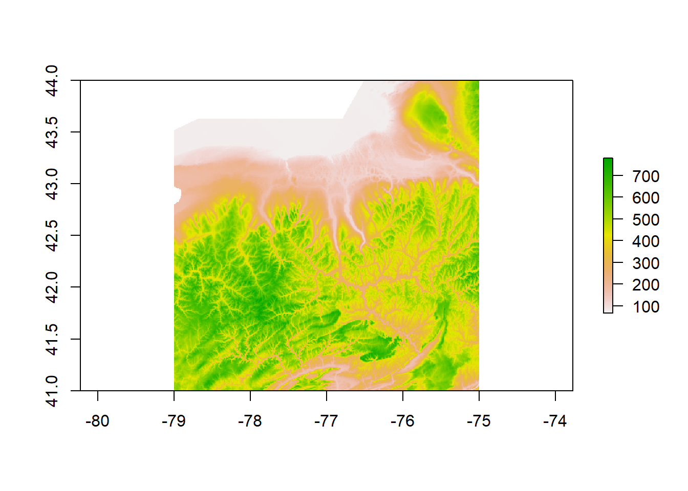
DEM for Finger Lakes Region
The above plot is the DEM data from the region of interest surrounding the Finger Lakes. The DEM was cropped followed a wide girth around the lakes because it is hard to tell just by looking at the DEM data how far each lake’s watershed might extend.
plot(Slope)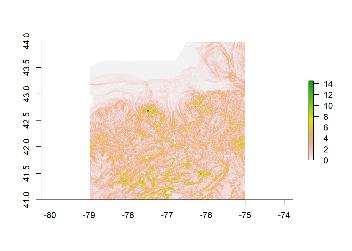
Slope for Finger Lakes Region
The above plot demonstrates how the slope changes throughout the region of interest. Slope plays an important part in the process of how water moves through a watershed since water follows the path of least resistance.
plot(Aspect)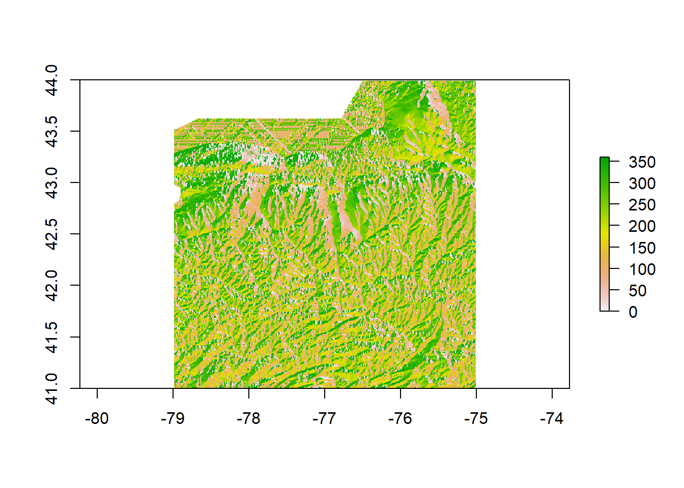
Aspect for Finger Lakes Region
The above plot demonstrates the aspect of the land in the Finger Lakes Region. Since aspect informs about the compass direction any given slope faces, understanding the aspect of the terrain is also an important consideration in trying to understand how water might move through the watershed.
plot(FlowDir)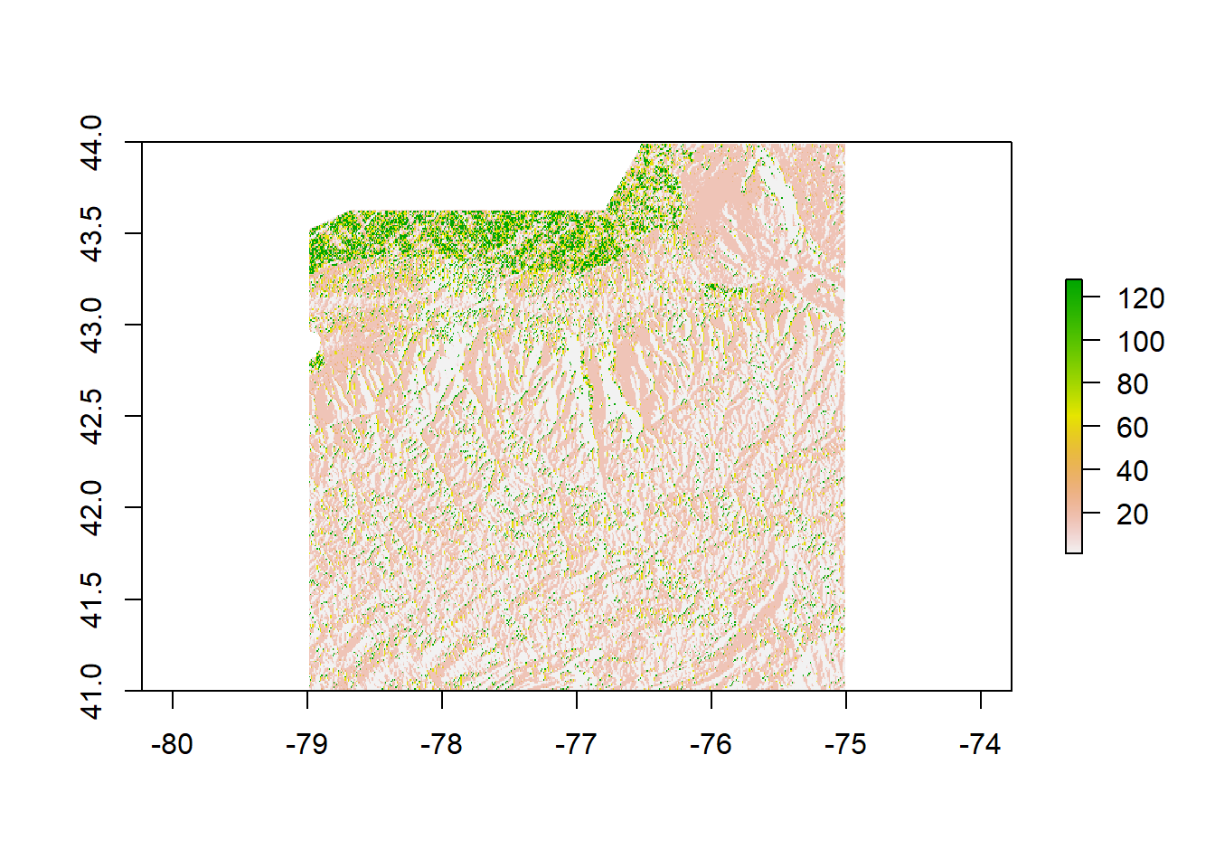
Flow Direction for Finger Lakes Region
This plot demonstrates the flow direction within the region of interest. The legend for this parameter goes up to 128. These legend values are not necessarily intuitive. To understand, think of water falling into a pixel. If the water does not stay in that pixel, it can go one of eight directions, to one of the eight surrounding pixels. Each pixel can be represented by a number. The numerical scale of the legend can then be understood as follows:
East : 2^0 = 1 Southeast : 2^1 = 2 South : 2^2 = 4 Southwest : 2^3 = 8 West : 2^4 = 16 Northwest : 2^5 = 32 North : 2^6 = 64 Northeast : 2^7 = 128
Loading Watershed Boundaries into R from GRASS
plot(watersheds)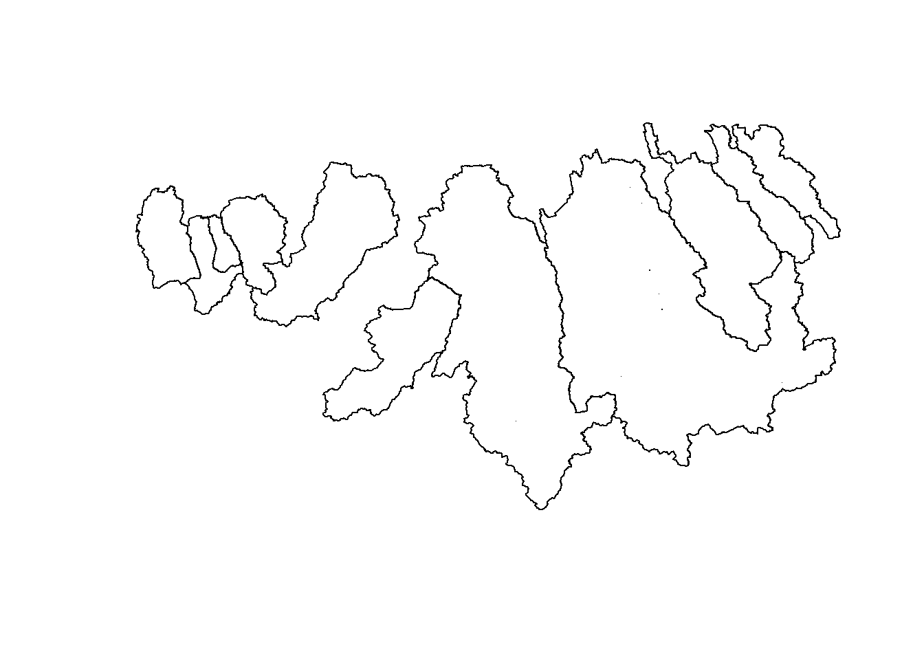
Watershed Boundaries: Finger Lakes Region, NY
Originally, I had hoped to complete the entire watershed delineation within R using the rgrass7 package. This package theoretically calls on the GRASS software in order to utilize GRASS’s watershed tools. The code seemed simple, and yet was very reluctant to work. Having some experience delineating watershed boundaries from within GRASS, I know that the process is not exactly straight forward even within GRASS itself, so it makes sense that it would not be using R as a proxy either. Instead, I worked within the GRASS GUI in order to produce watershed boundaries using the DEM data we already have. This watershed shapefile can be seen above.
Overlaying Watershed Boundaries onto DEM
DEM_proj=raster(x = 'data/dem_flr_proj.tif')
DEM_proj_crop=crop(DEM_proj,extent(250000,420000,4650000,4800000),filename=file.path(datadir,"DEM_crop.tif"),overwrite=T)
plot(DEM_proj_crop)
plot(watersheds_proj, add=T)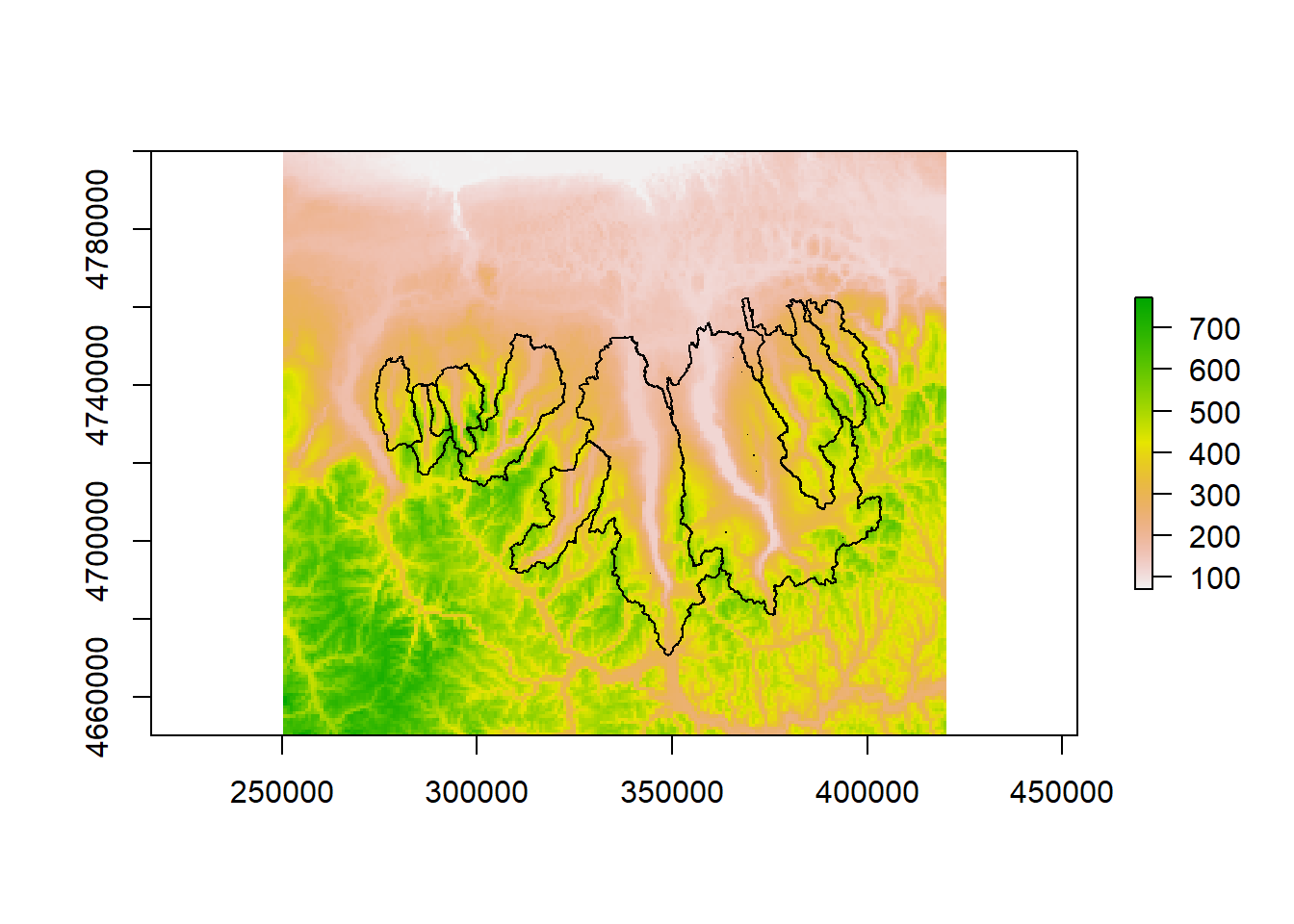
Overlaying Watershed Boundaries over DEM
Here, we can see how the watershed boundaries fit nicely onto the DEM from earlier in a way that makes sense visually. Boundaries fall on what appear to be local high points between the lakes.
The reluctance of R to be useful in the watershed delineation process, however, turned out to be useful. Instead of the focus of this project being on watershed delineation, we can take it a step further in order to understand more about the land use within the watersheds.
Land Use Classification Data via Analysis of Landsat 8 Image with Validation Information
plot(landuse)
Land Use Classification derived from a Landsat 8 OLI Image from April 23, 2017
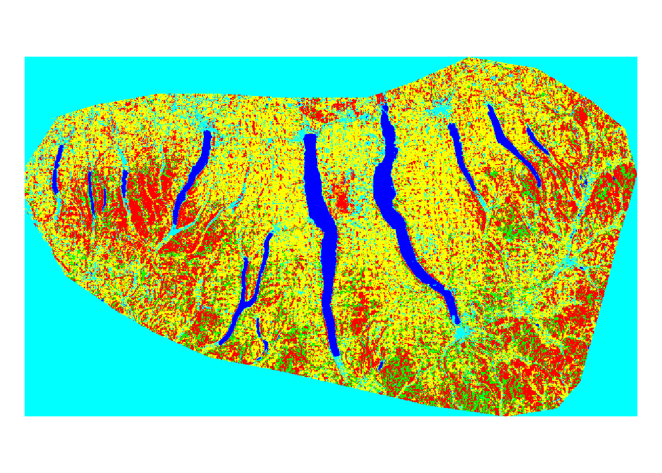
Land Use Classification derived from a Landsat 8 OLI Image from April 23, 2017
conf_mat=load.image(file = 'data/accuracy.jpg')
plot(conf_mat)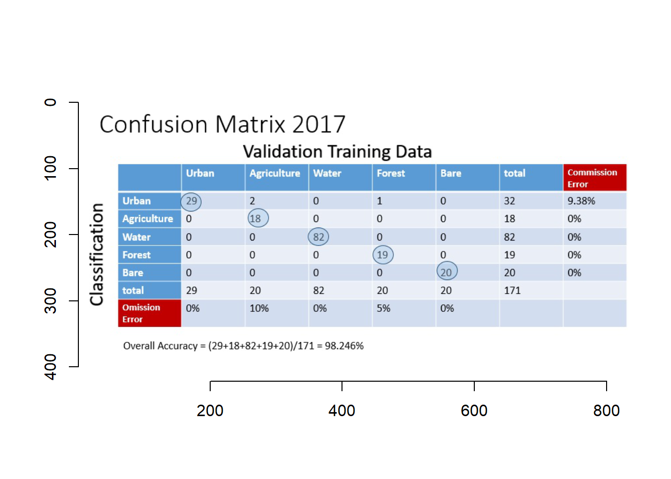
Land Use Classification derived from a Landsat 8 OLI Image from April 23, 2017
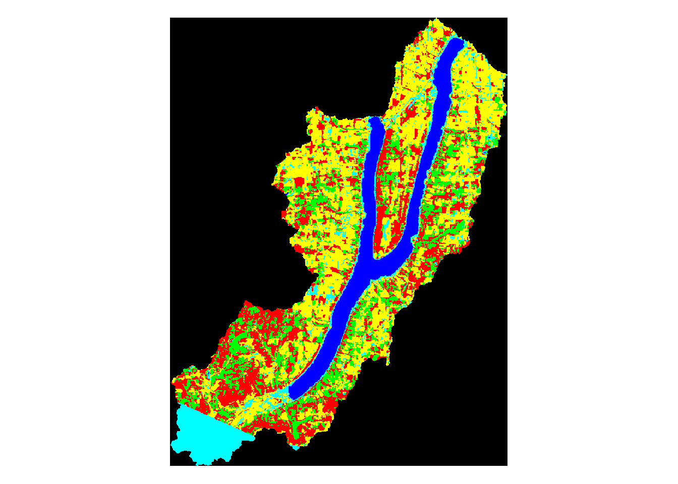
The above map was created by me in ENVI. I used an image from Landsat 8 OLI captured on April 23, 2017 that was downloaded from USGS’s National Map. The image was preprocessed and then a supervised classification was run on the image. In the classification map above, various colors represent different types of land use. In the above image, the colors signify:
Yellow - Agriculture Green - Forest Red - Bare Land Blue - Water Light blue - Urban
While this land use map is in no way perfect, validation of the classification did indicate a high accuracy of classification. Using training samples collected from higher spatial resolution imagery, a confusion matrix was constructed and demonstrates an overall accuracy of 98.246%. This lends some confidence to the classification results, supporting its usefulness in the watershed analysis.
Watershed / Land Use Overlay Analysis
plot(landuse)
Overlaying Watershed Boundaries over Land Use Classification Map
plot(watersheds_proj, add=T)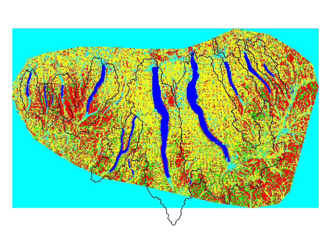
Overlaying Watershed Boundaries over Land Use Classification Map
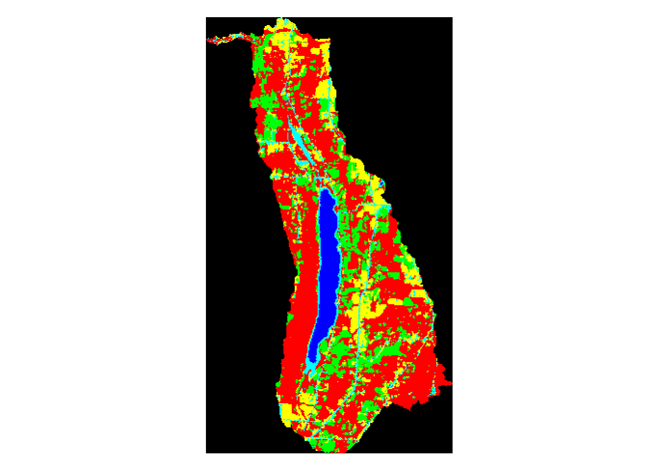
In the above map, we can see how the land use varies between watersheds. There is clearly and issue at the bottom of the land use map where the boundary of the original Landsat image did not extend to the full reach of two of the central Finger Lakes. This should and will be addressed in future land use classification analysis by overlaying two adjacent Landsat images.
For the purposes of this project, however, we can still do our analysis, simply keeping in mind that the information we have for lakes 5 and 6, Keuka Lake and Seneca Lake, are incomplete.
Plotting New Watershed Polygons for each of the 11 Finger Lakes
plot(conesus, main='Conesus Lake Watershed')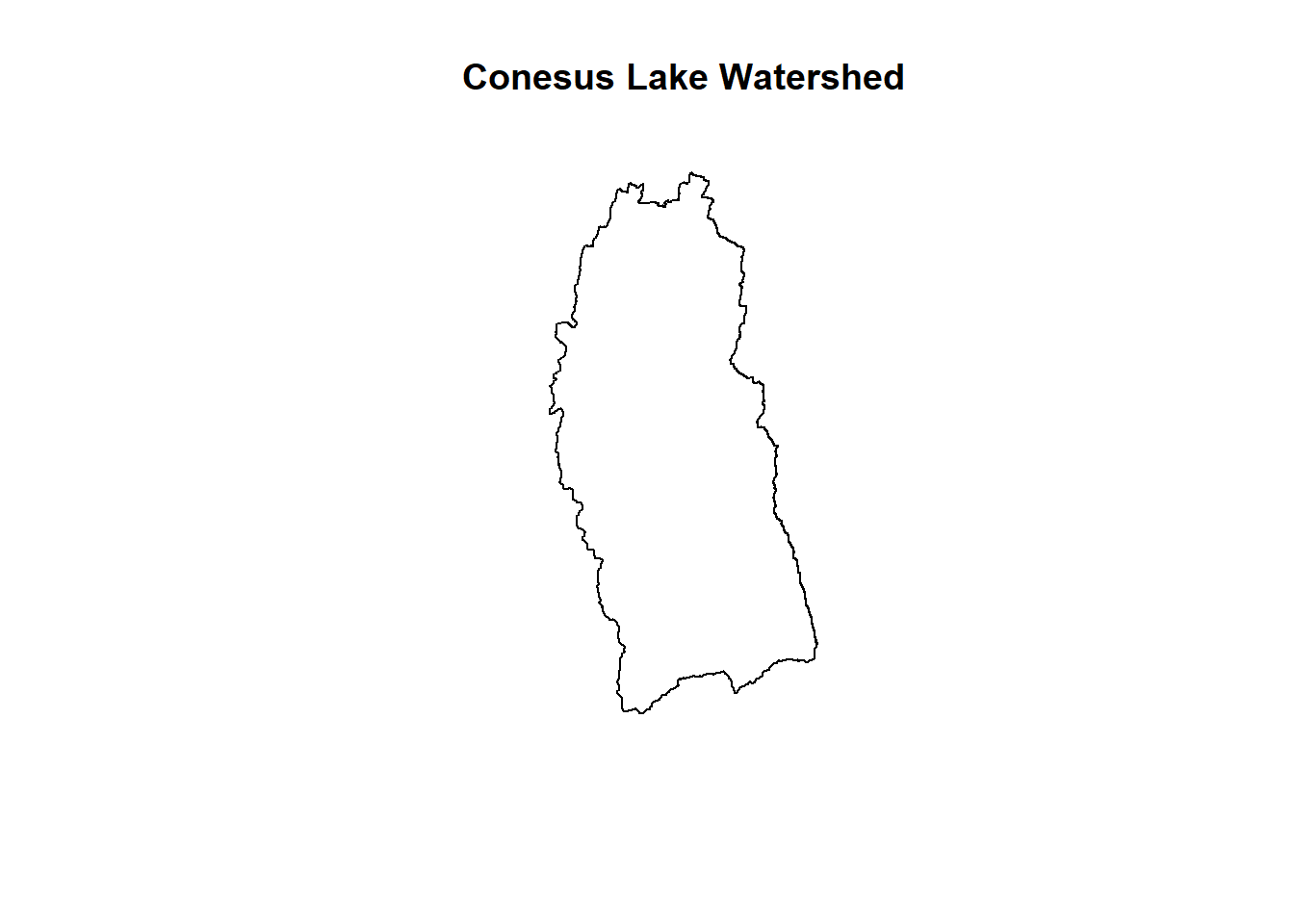
Separation of the Watersheds from Multipolygon
plot(otisco, main='Otisco Lake Watershed')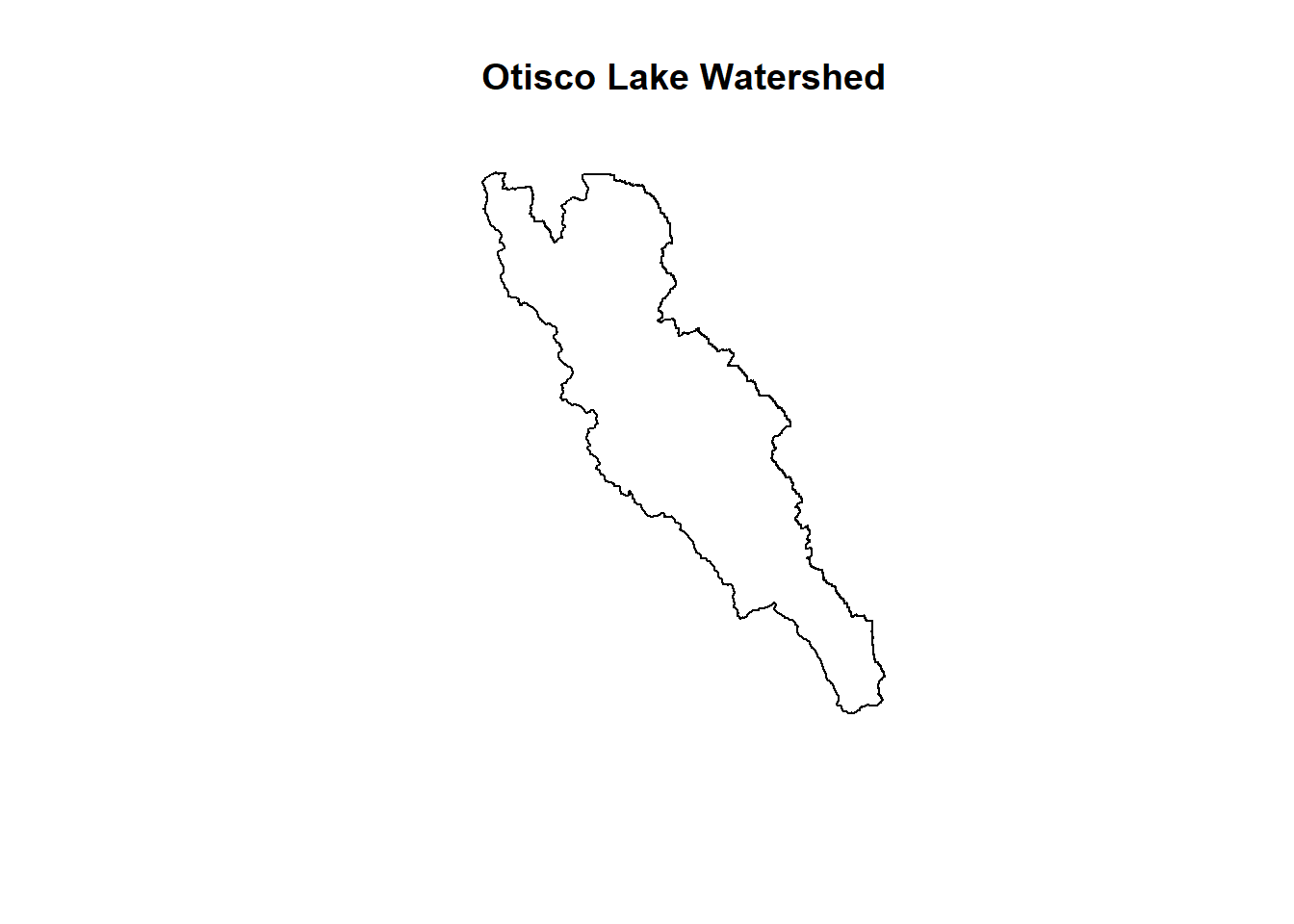
Separation of the Watersheds from Multipolygon
plot(skaneateles, main='Skaneateles Lake Watershed')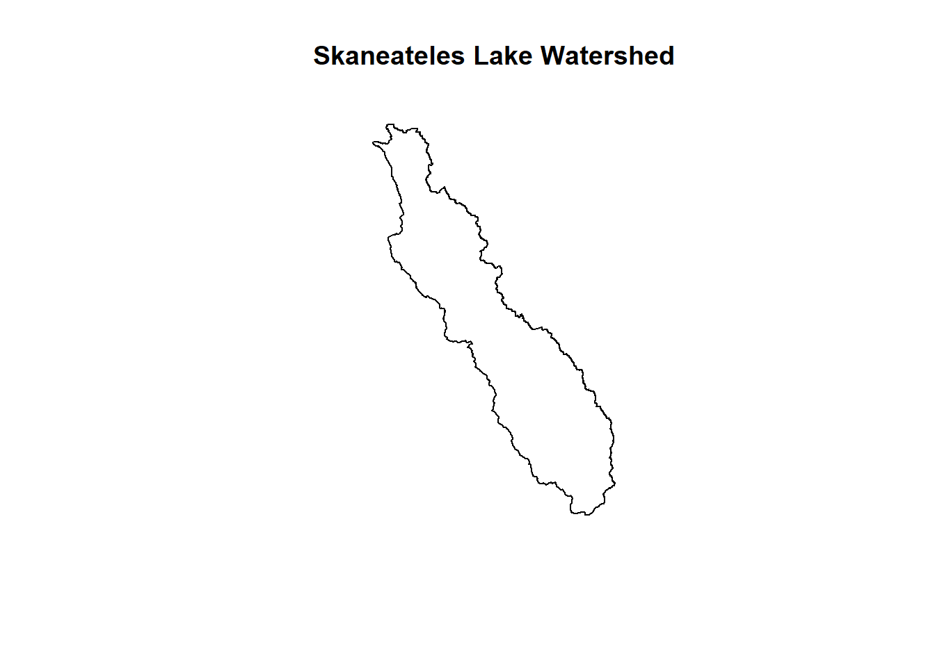
Separation of the Watersheds from Multipolygon
plot(honeoye, main='Honeoye Lake Watershed')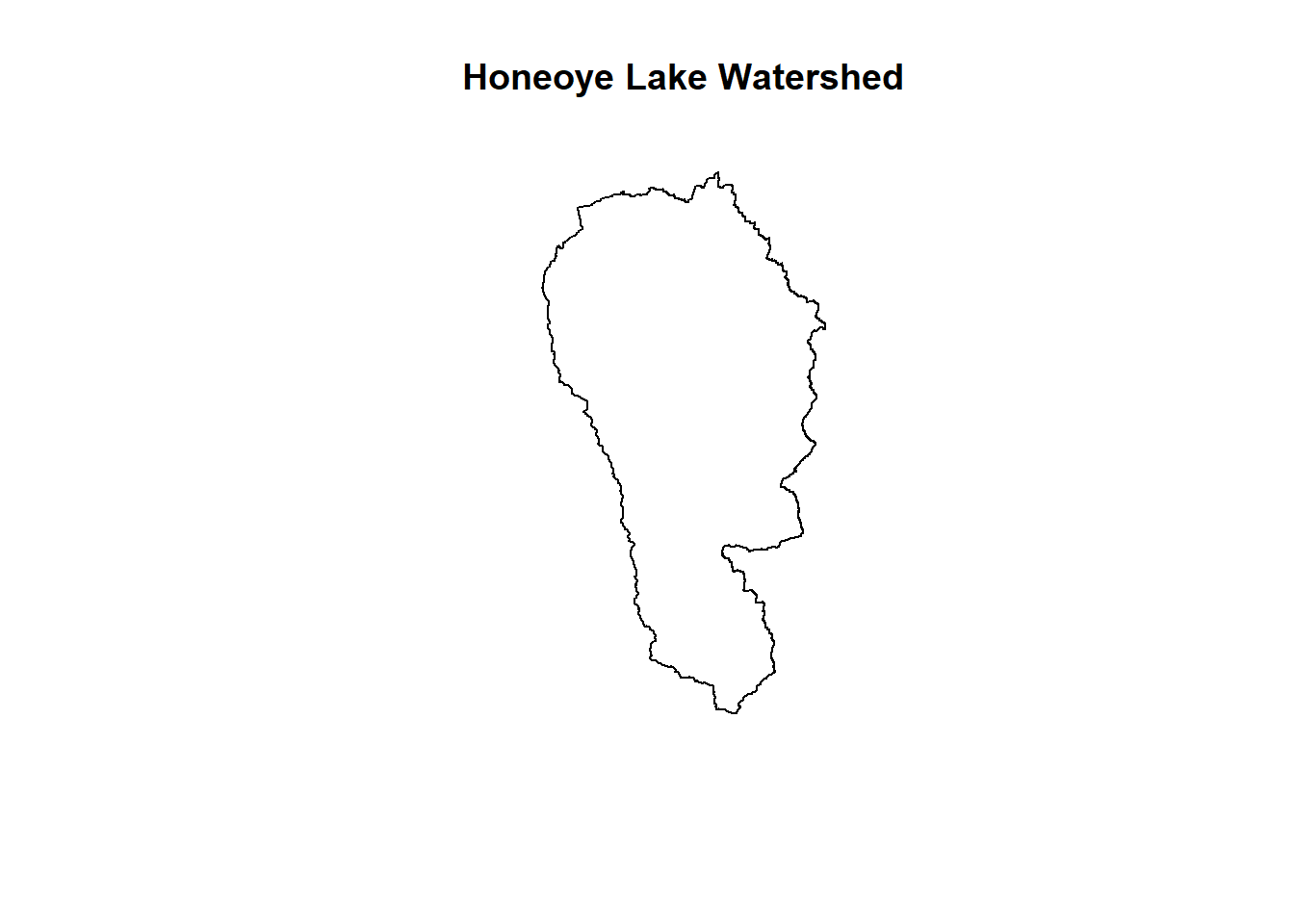
Separation of the Watersheds from Multipolygon
plot(canandaigua,main='Canandaigua Lake Watershed')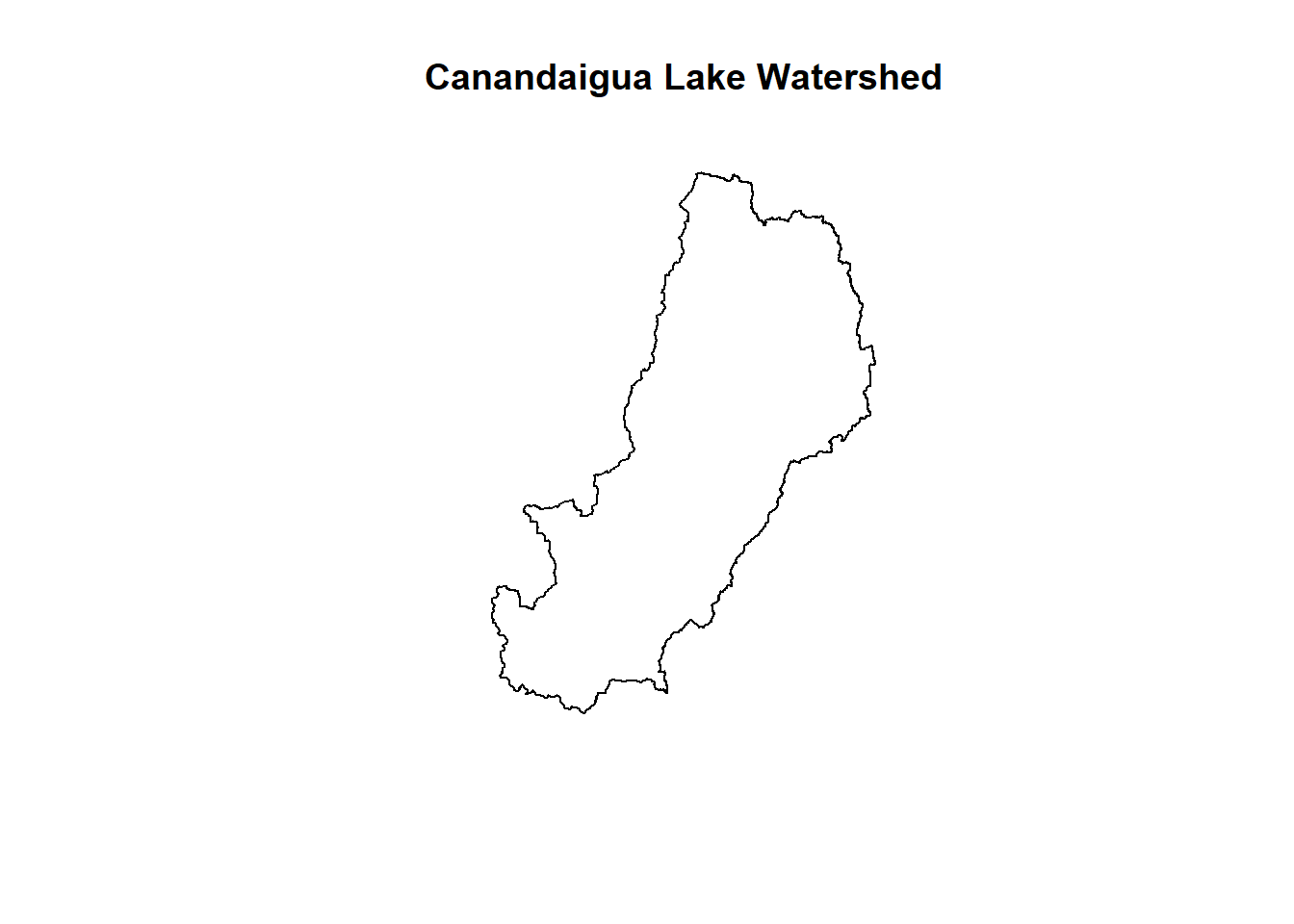
Separation of the Watersheds from Multipolygon
plot(owasco,main='Owasco Lake Watershed')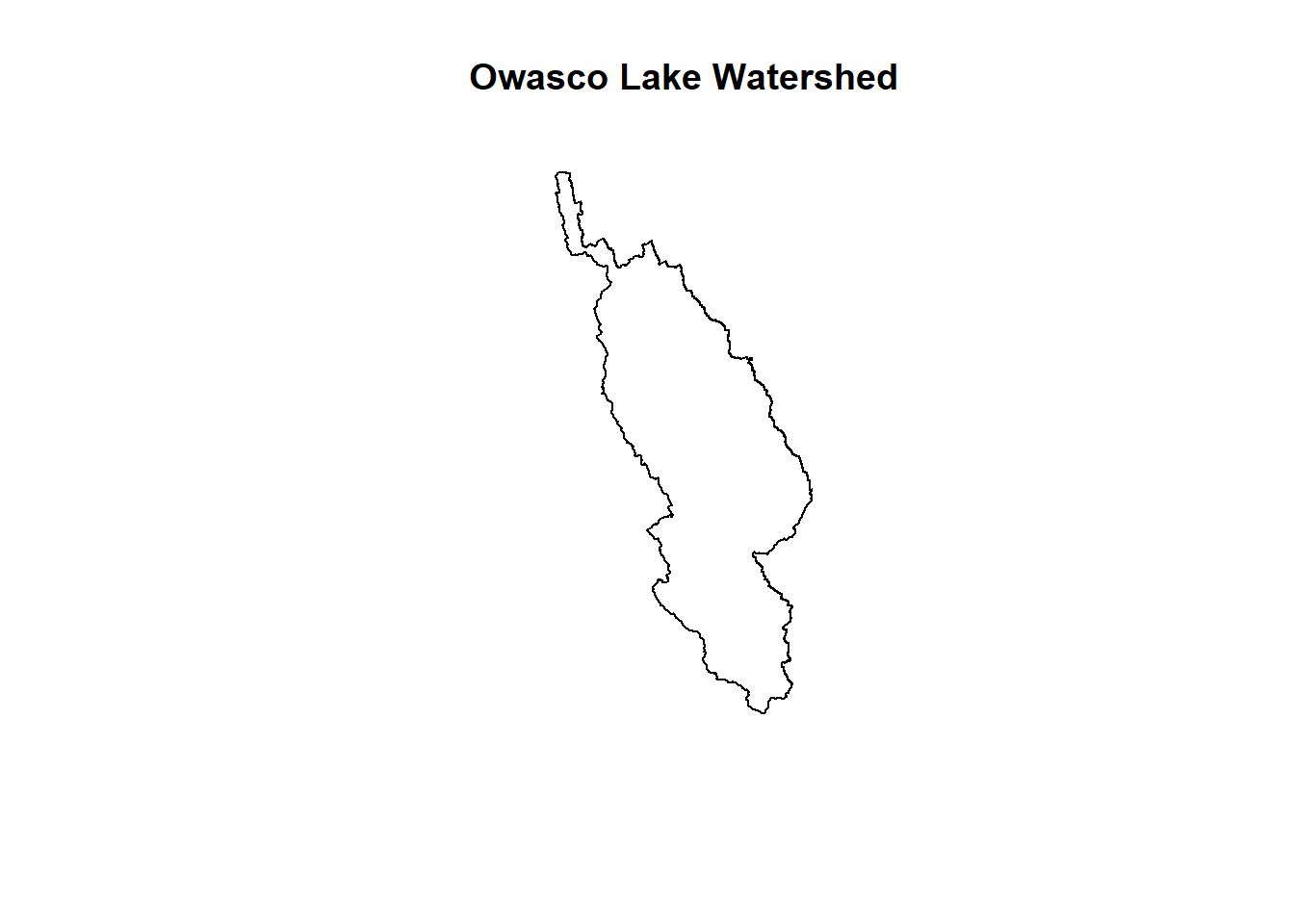
Separation of the Watersheds from Multipolygon
plot(cayuga,main='Cayuga Lake Watershed')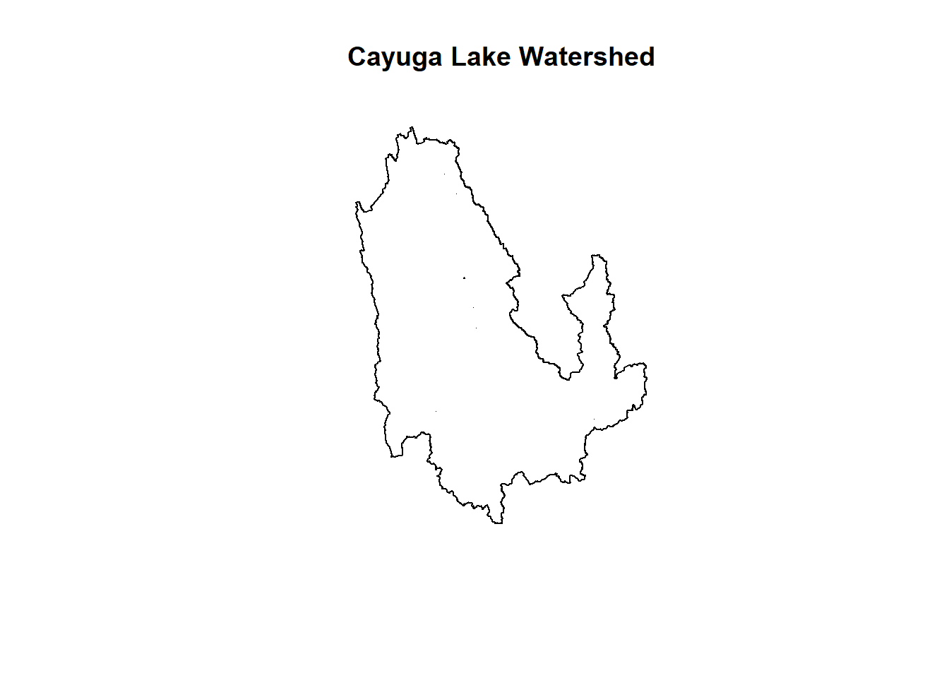
Separation of the Watersheds from Multipolygon
plot(seneca,main='Seneca Lake Watershed')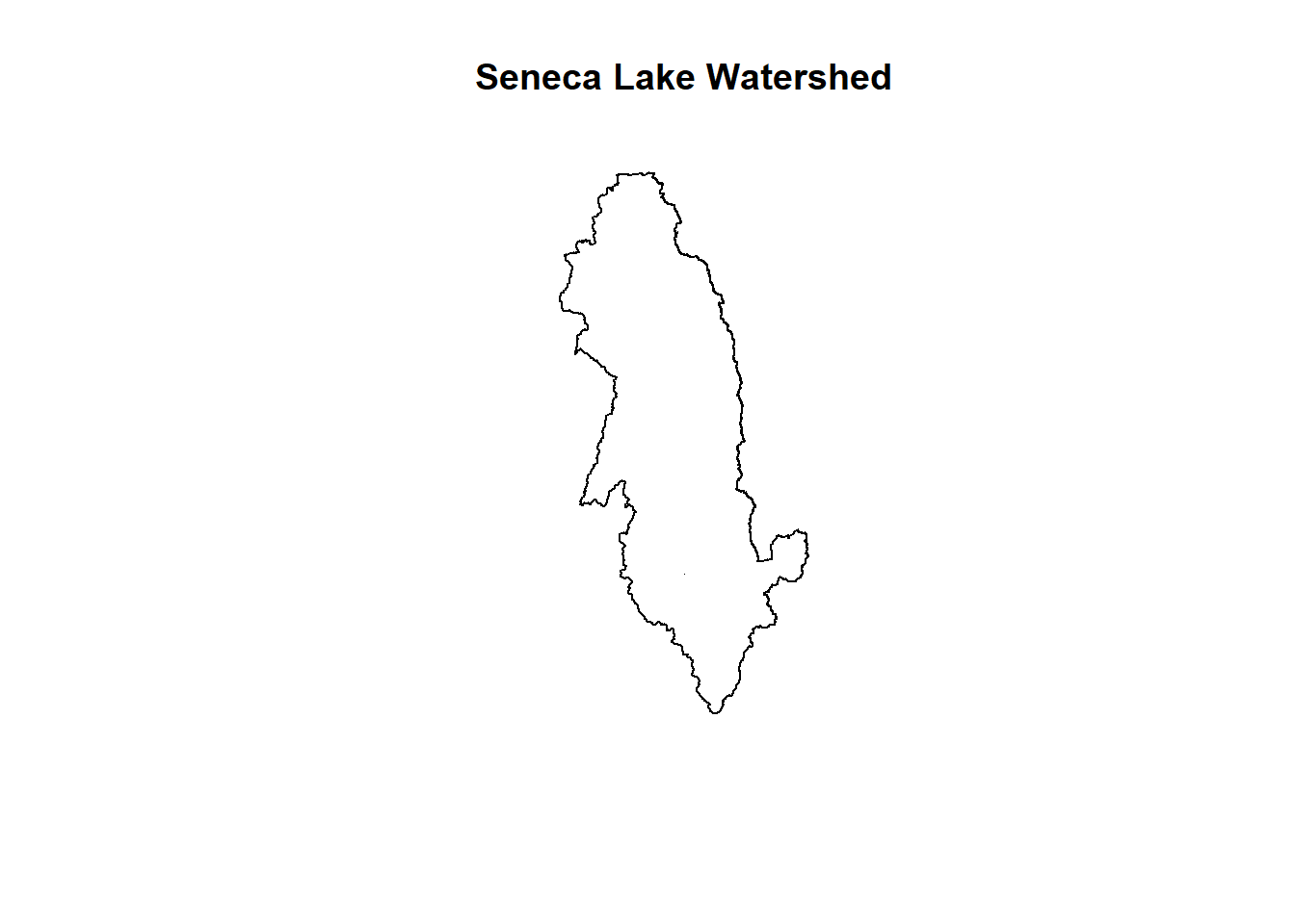
Separation of the Watersheds from Multipolygon
plot(keuka,main='Keuka Lake Watershed')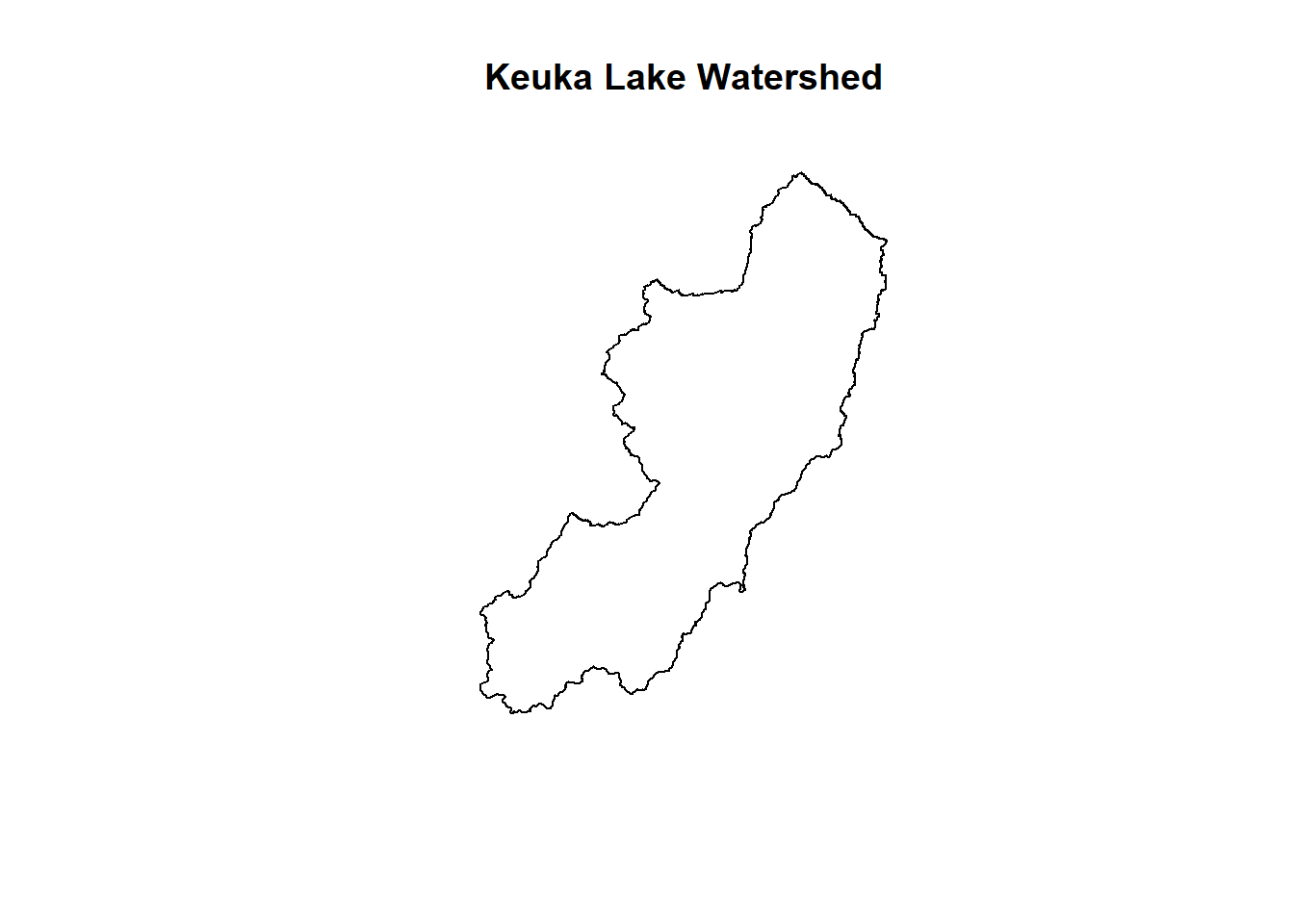
Separation of the Watersheds from Multipolygon
plot(canadice,main='Canadice Lake Watershed')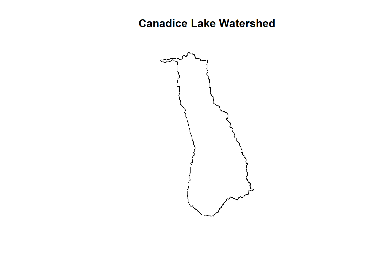
Separation of the Watersheds from Multipolygon
plot(hemlock,main='Hemlock Lake Watershed')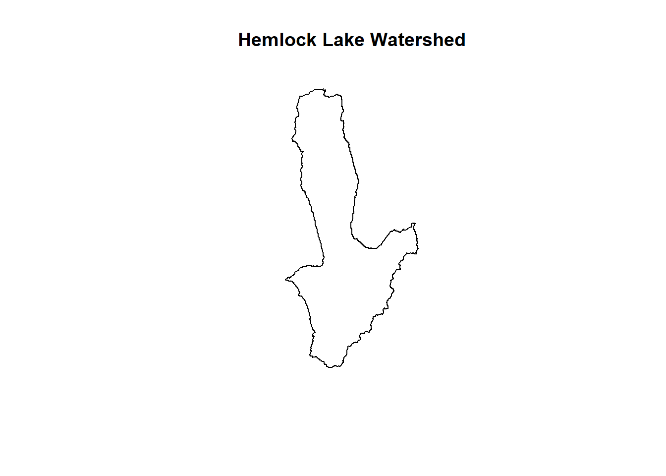
Separation of the Watersheds from Multipolygon
In the above, we show the separated multipolygon as 11 new polygons representing the watersheds of each individual lake. ## Plotting Land Use Maps for each of the 11 Finger Lakes
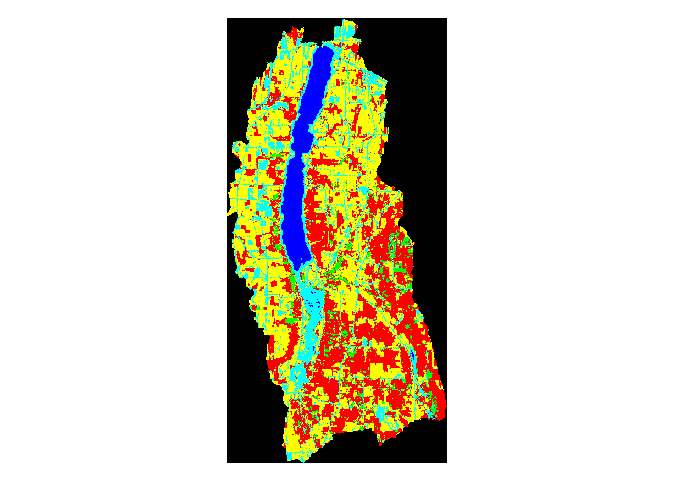
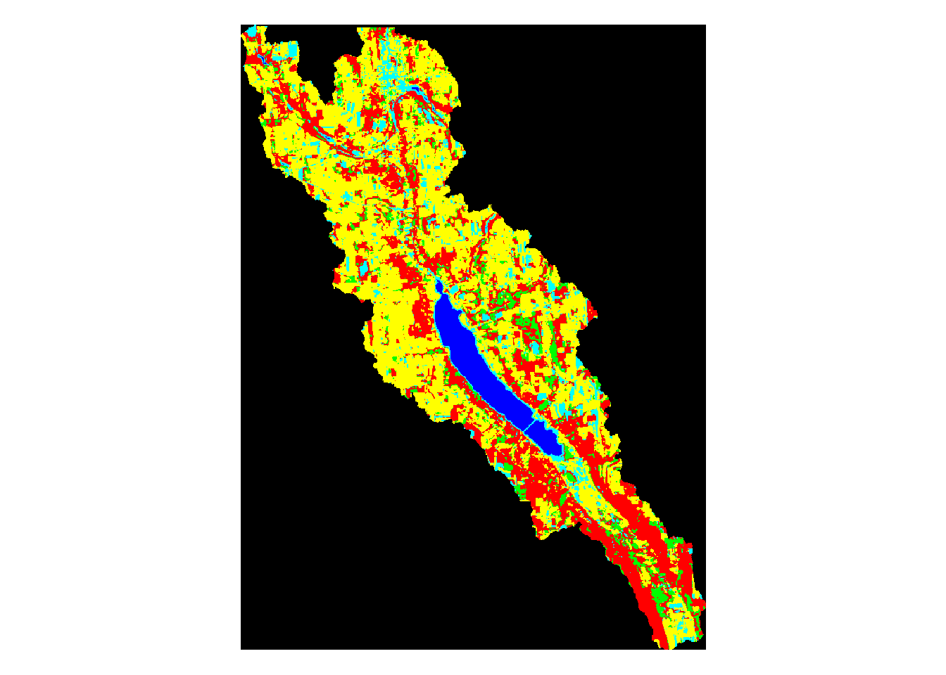
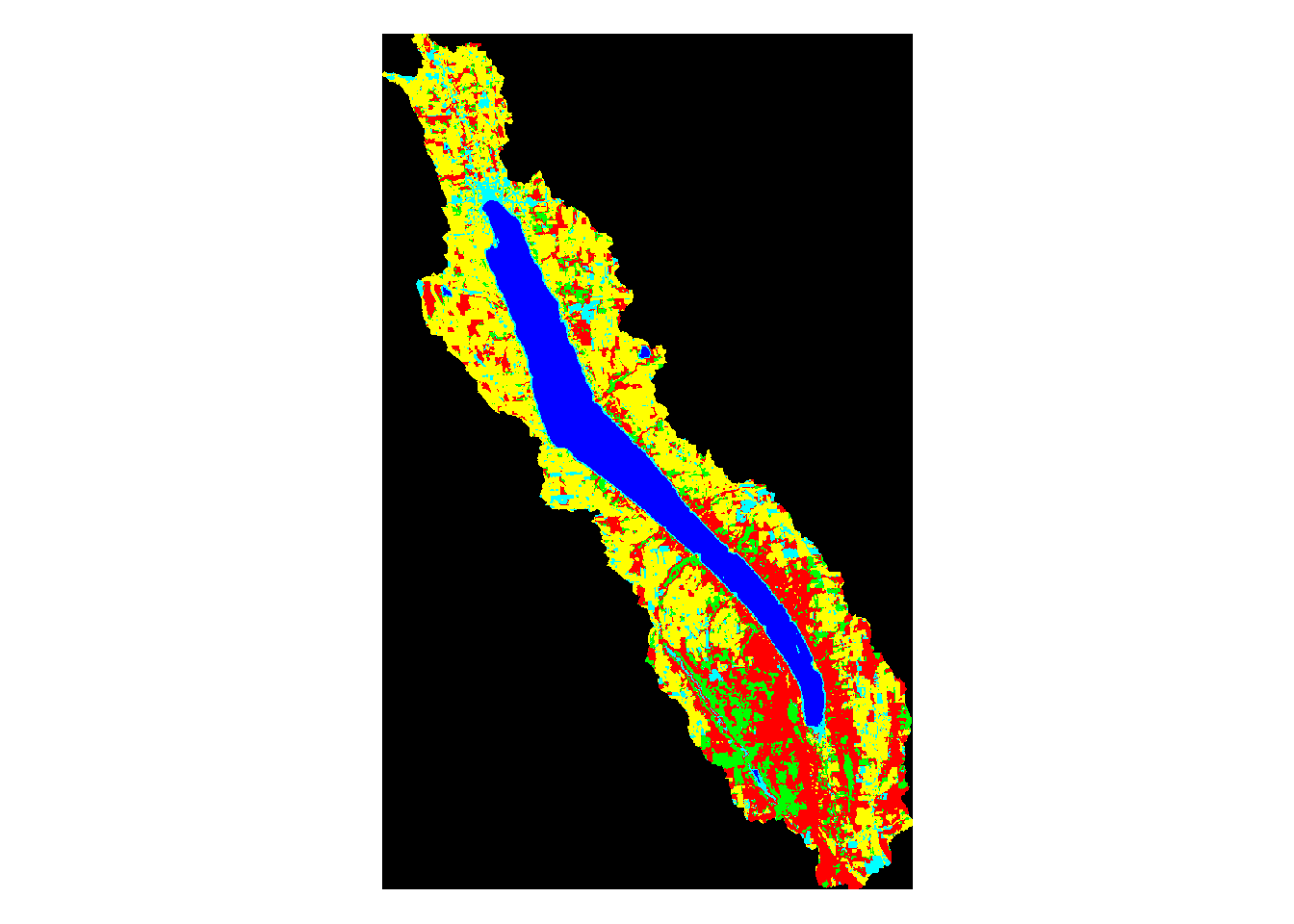
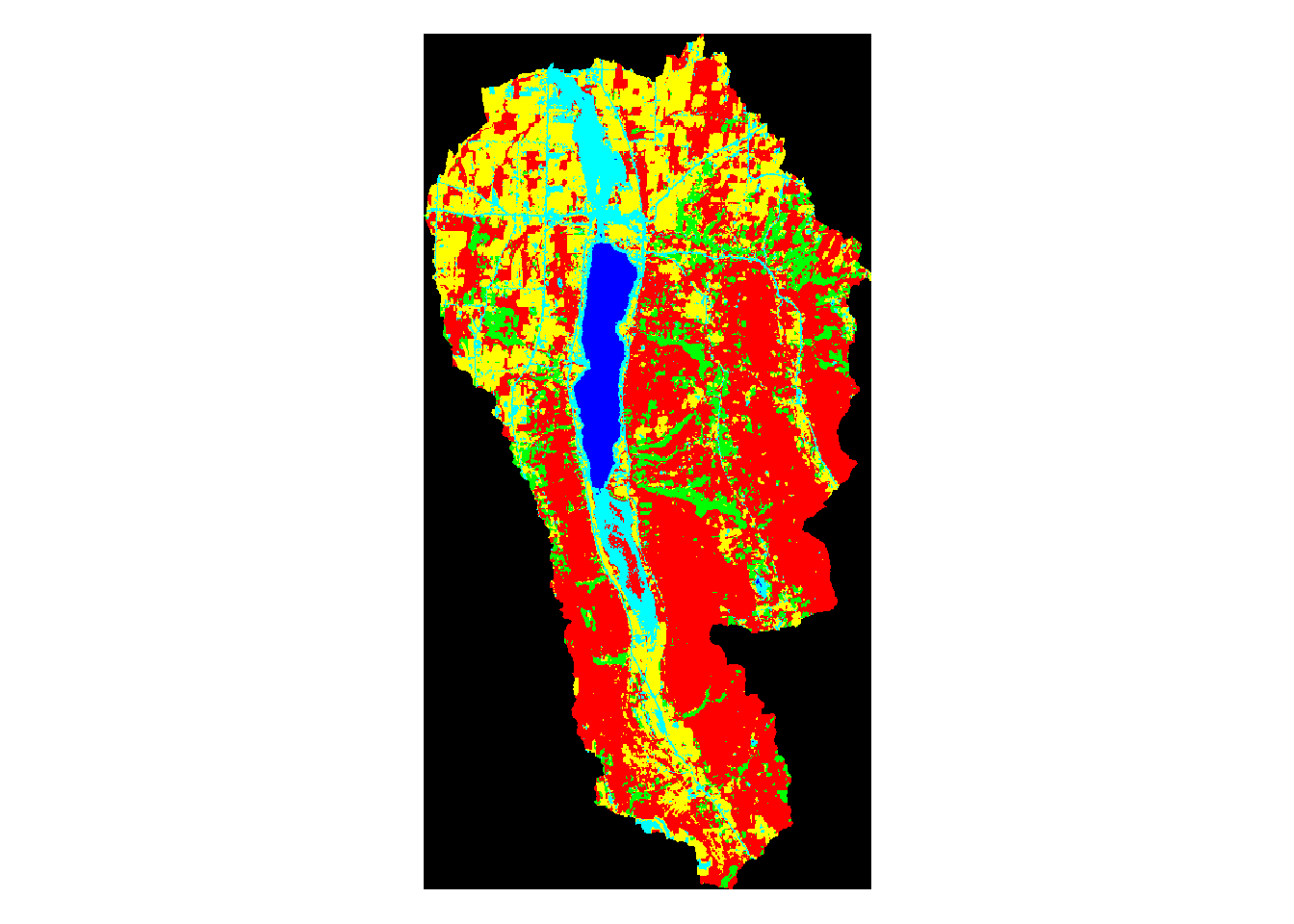
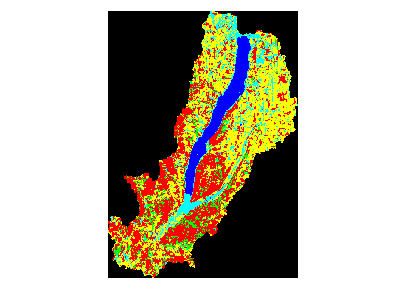
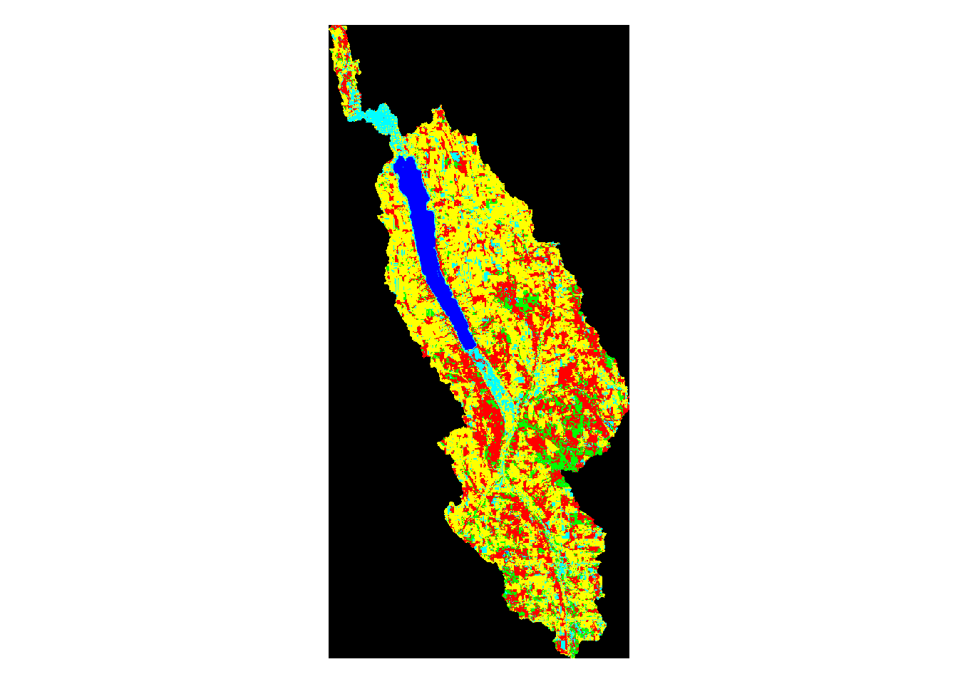
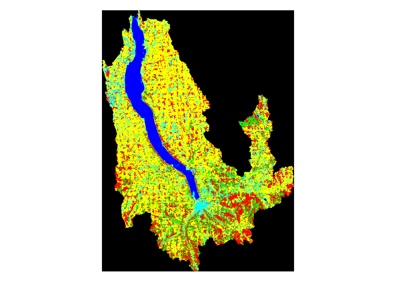
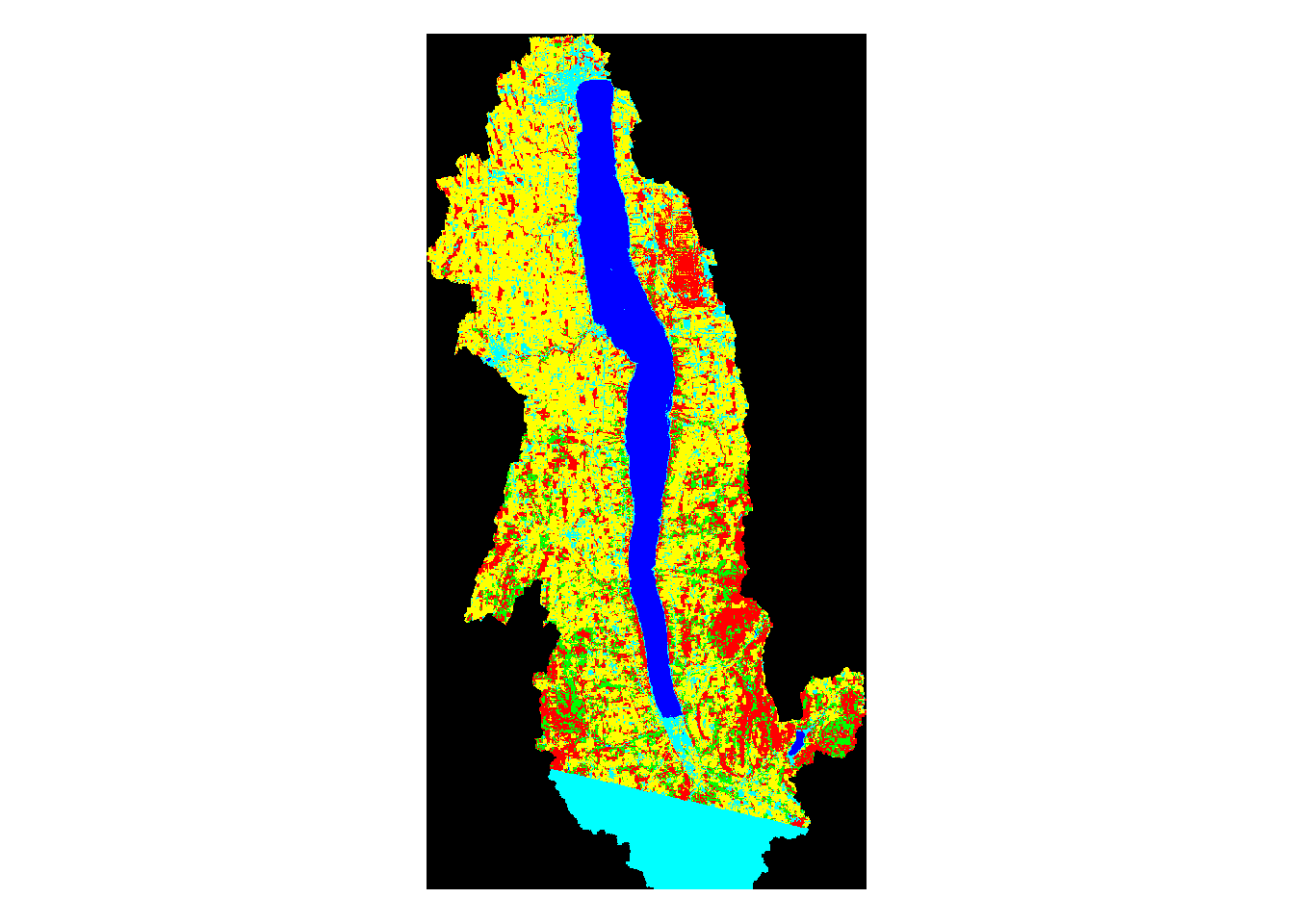
#Plotting all 11 watershed land use clips
plot(mask_conesus,main='Conesus Watershed Land Use')
plot(mask_otisco,main='Otisco Watershed Land Use')
plot(mask_skaneateles,main='Skaneateles Watershed Land Use')
plot(mask_honeoye,main='Honeoye Watershed Land Use')
plot(mask_canandaigua,main='Canandaigua Watershed Land Use')
plot(mask_owasco,main='Owasco Watershed Land Use')
plot(mask_cayuga,main='Cayuga Watershed Land Use')
plot(mask_seneca,main='Seneca Watershed Land Use')
plot(mask_keuka,main='Keuka Watershed Land Use')
plot(mask_canadice,main='Canadice Watershed Land Use')
plot(mask_hemlock,main='Hemlock Watershed Land Use')
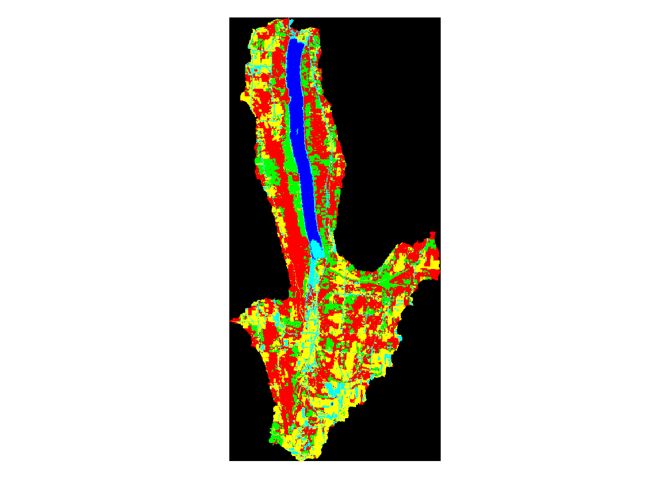 Above, we can see the land use classification map of each separate watershed. It is clear simply by looking at them that some of the lakes have very different land use make ups than the others.
Summary Table
datatable(FL_results, options = list(pageLength = 6))Summary Table of Land Use Data for All 11 Watersheds
The table above summarizes the watershed data for each of the eleven Finger Lakes. For each lake, the data table shows the proportion of watershed made up by each land use type, the total watershed area in square kilometers, the total surface area of the lake in square kilometers, and the total number of weeks that each lake had recorded cyanobacterial blooms from 2012-2017.
Scatter Plots
# Proportion of Watershed that is Urban vs. # weeks of recorded bloom
plot(x = FL_results$U_prop,y = FL_results$BlmWks,main='Urban Watershed Proportion vs. Bloom Weeks')
abline(lm(FL_results$BlmWks~FL_results$U_prop), col="red")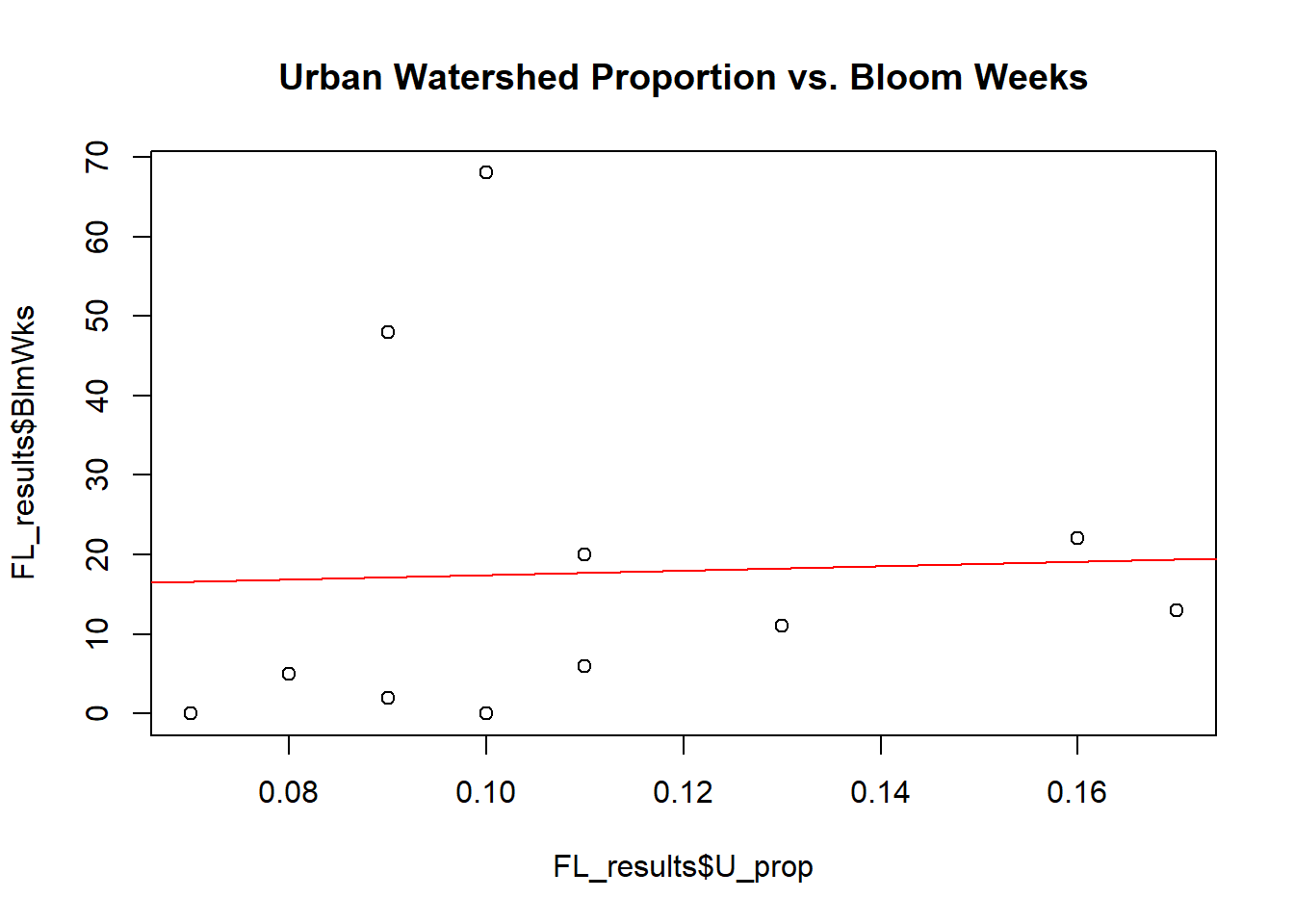
Looking for Relationships in the Data via Scatter Plots and Linear Regression Lines
# Proportion of Watershed that is Agricultural vs. # weeks of recorded bloom
plot(x = FL_results$A_prop,y = FL_results$BlmWks,main='Agricultural Watershed Proportion vs. Bloom Weeks')
abline(lm(FL_results$BlmWks~FL_results$A_prop), col="red")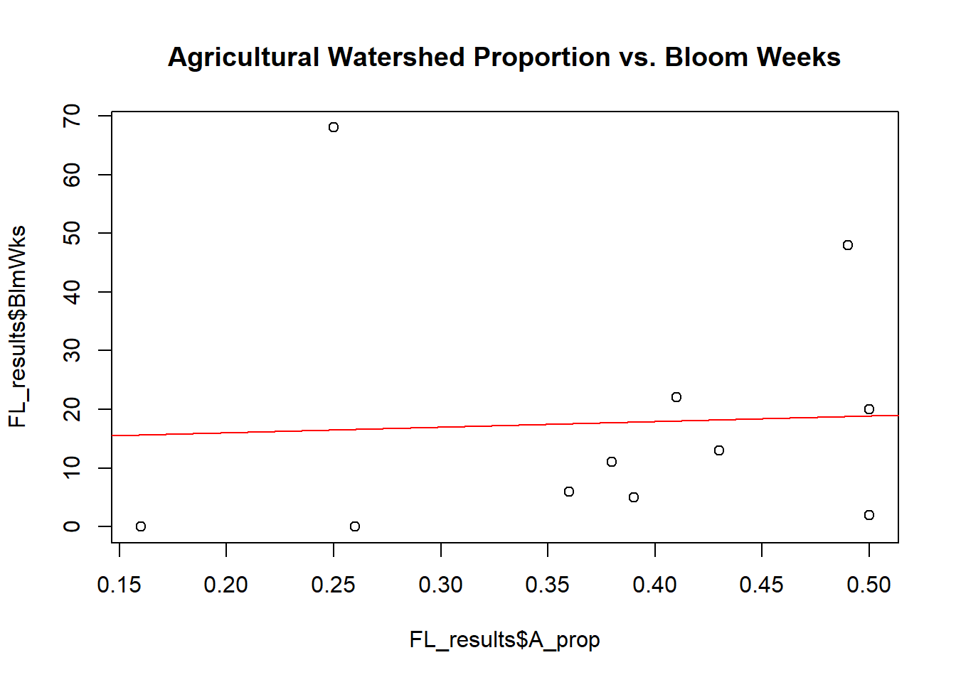
Looking for Relationships in the Data via Scatter Plots and Linear Regression Lines
# Proportion of Watershed that is Water vs. # weeks of recorded bloom
plot(x = FL_results$W_prop,y = FL_results$BlmWks,main='Water Watershed Proportion vs. Bloom Weeks')
abline(lm(FL_results$BlmWks~FL_results$W_prop), col="red")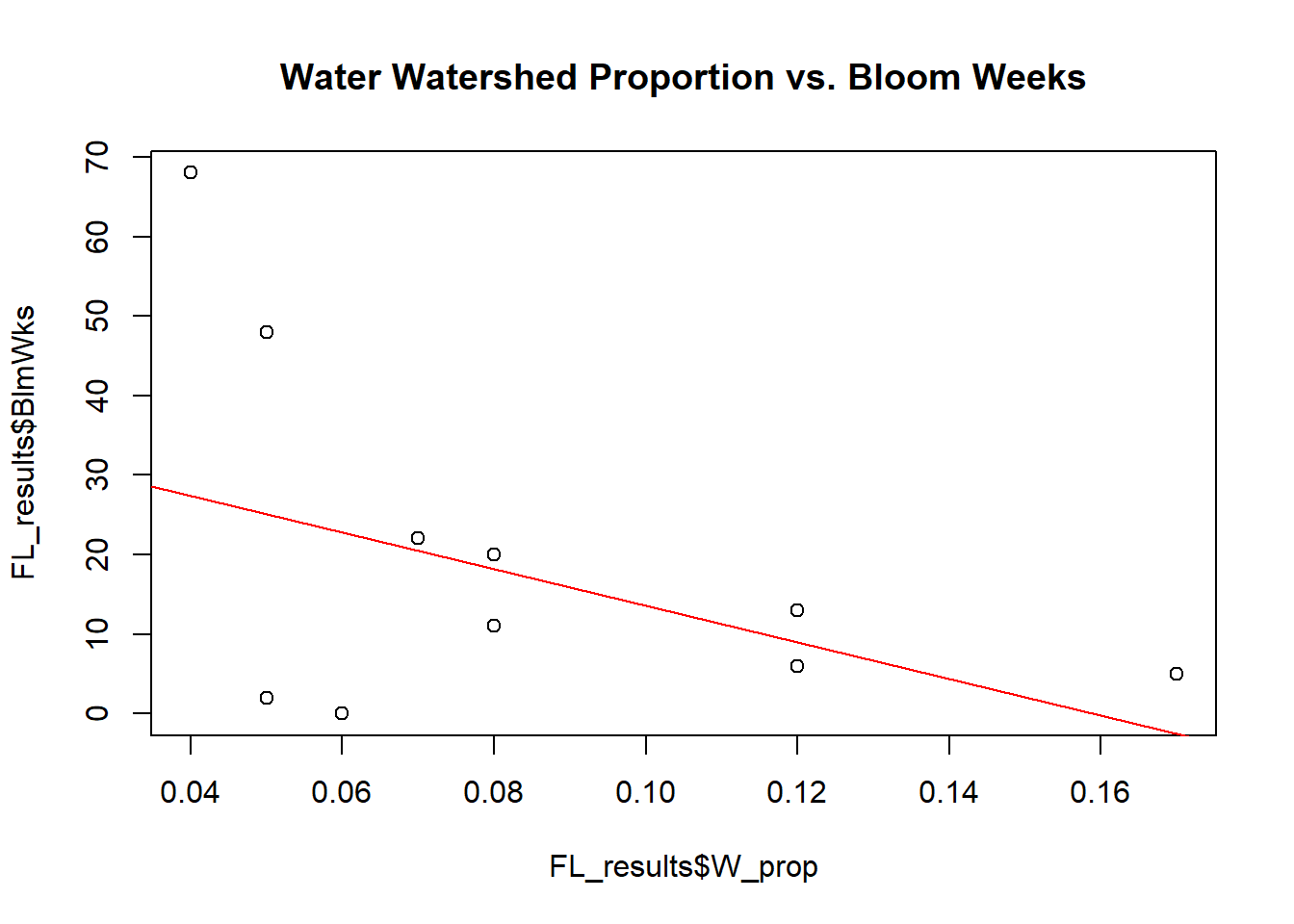
Looking for Relationships in the Data via Scatter Plots and Linear Regression Lines
# Proportion of Watershed that is Forest vs. # weeks of recorded bloom
plot(x = FL_results$F_prop,y = FL_results$BlmWks,main='Forest Watershed Proportion vs. Bloom Weeks')
abline(lm(FL_results$BlmWks~FL_results$F_prop), col="red")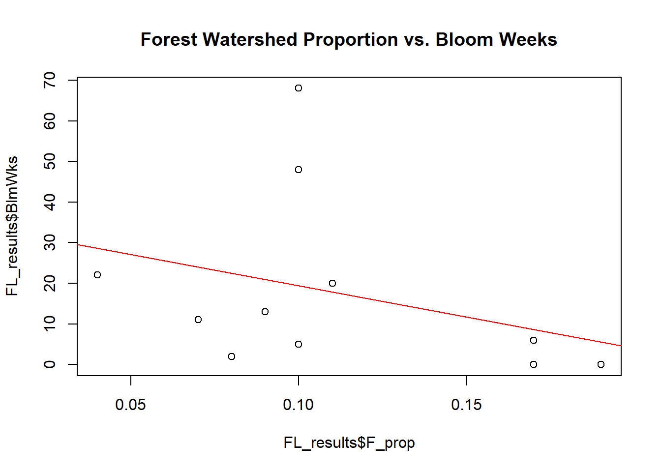
Looking for Relationships in the Data via Scatter Plots and Linear Regression Lines
# Proportion of Watershed that is Bare Land vs. # weeks of recorded bloom
plot(x = FL_results$B_prop,y = FL_results$BlmWks,main='Bare Land Watershed Proportion vs. Bloom Weeks')
abline(lm(FL_results$BlmWks~FL_results$B_prop), col="red")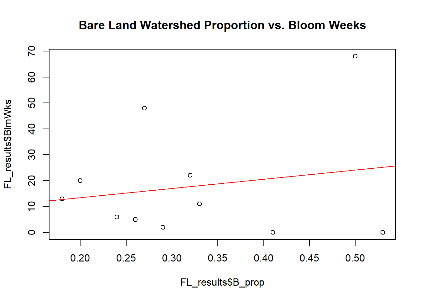
Looking for Relationships in the Data via Scatter Plots and Linear Regression Lines
# Size of Watershed vs. # weeks of recorded bloom
plot(x = FL_results$Wtshd_Area,y = FL_results$BlmWks,main='Watershed Size (km2) vs. Bloom Weeks')
abline(lm(FL_results$BlmWks~FL_results$Wtshd_Area), col="red")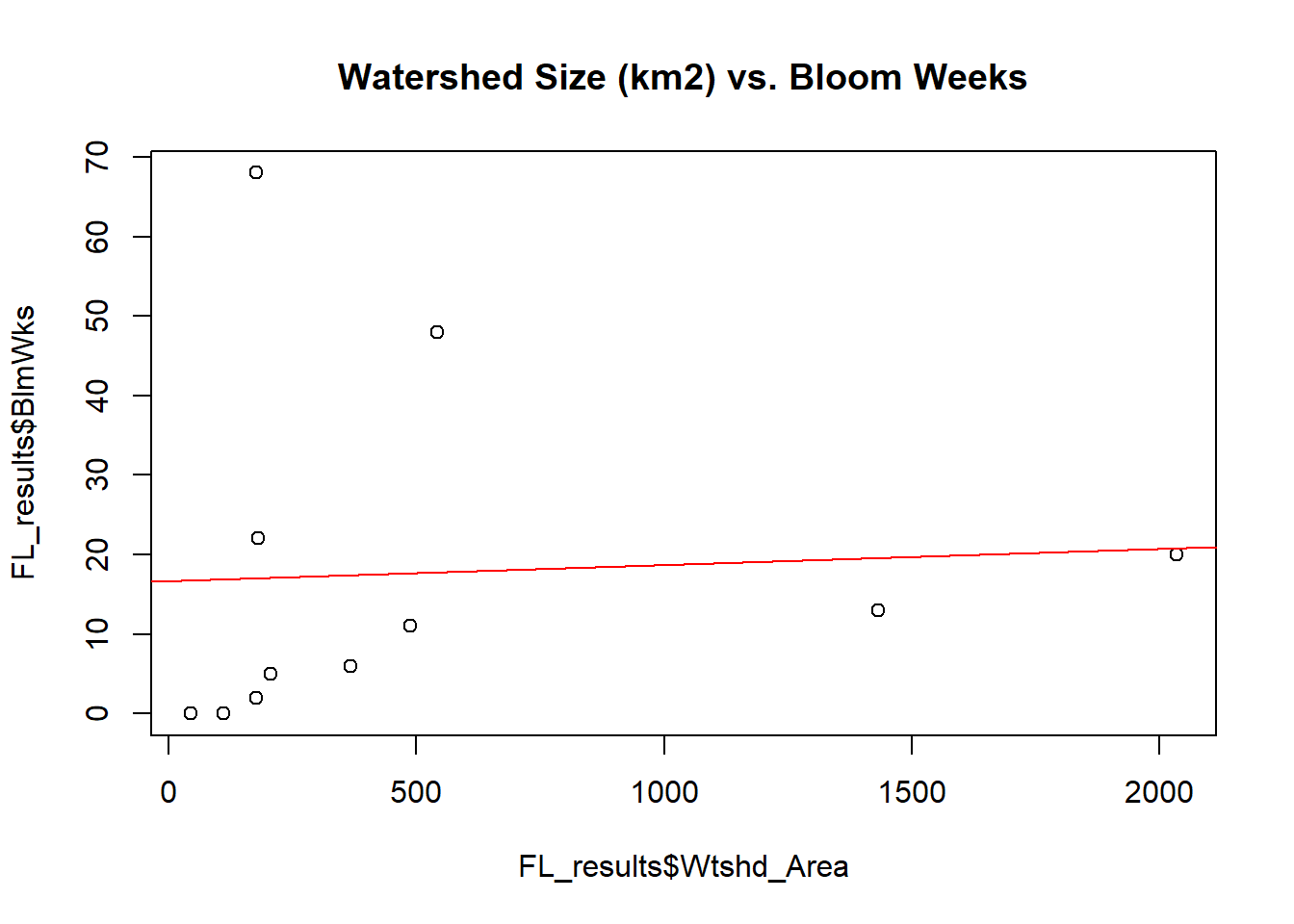
Looking for Relationships in the Data via Scatter Plots and Linear Regression Lines
# Size of Lake vs. # weeks of recorded bloom
plot(x = FL_results$Lake_Area,y = FL_results$BlmWks,main='Lake Surface Area (km2) vs. Bloom Weeks')
abline(lm(FL_results$BlmWks~FL_results$Lake_Area), col="red")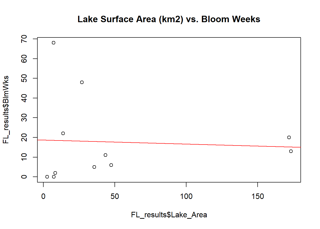
Looking for Relationships in the Data via Scatter Plots and Linear Regression Lines
# Ratio of Lake surface area to Watershed Area vs. # weeks of recorded bloom
plot(x = FL_results$LW_prop,y = FL_results$BlmWks,main='Lake:Watershed Proportion vs. Bloom Weeks')
abline(lm(FL_results$BlmWks~FL_results$LW_prop), col="red")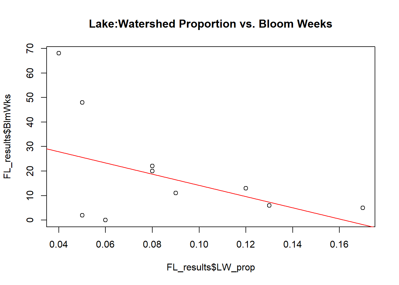
Looking for Relationships in the Data via Scatter Plots and Linear Regression Lines
Based on the scatter plots and best fit linear regression lines, it appears that the hypotheses that were made do not hold much merit. It was hypothesized that lakes demonstrating more frequent cyanobacterial blooms would have higher agricultural and urban watershed proportions since agricultural and urban lands tend to encourage surface runoff of nutrient-rich waters. The scatter plots and linear regression lines, however, show little relationship between both urban percentage and agricultural percentage with total number of recorded bloom weeks.
That is not to say, however, that no relationships were found. Interestingly, the scatter plot and linear regression line relating percent forested land to number of bloom weeks suggests that as the proportion of watershed that is forested increases, bloom frequency tends to decrease.
In addition, the scatter plots and linear regression lines suggest that as the proportion of watershed that is made up of water increases, bloom frequency tends to decrease. Similarly, the relationships between Lake:Watershed proportion and frequency of blooms demonstrates the same trend– small lakes with large watersheds tend to have higher bloom frequencies than large lakes in small watersheds. All other relationships do not appear to be significant.
Conclusions
The original hypothesis for this study was that lakes with more frequent cyanobacterial blooms would likely have higher proportions of agricultural and urban land than lakes with less frequent cyanobacterial blooms. The idea behind this hypothesis is that cyanobacteria thrive in nutrient-rich waters, and nutrients largely runoff from agricultural lands and impervious surfaces. This hypothesis, however, is not supported by this study.
Interestingly, there was little to no relationship between the proportion of agricultural land or urban land in the watershed and the frequency of cyanobacterial blooms. It should be noted, however, that the data set on which the relationships are based is limited, based on only 11 lakes, so larger relationships may be missed in this analysis.
Still, some useful knowledge was gained from this study. While there was no relationship between agriculture or urban lands on cyanobacterial blooms, there were some relationships found. One of those relationships is between bloom frequency and the proportion of watershed that is forested. The linear regression best fit line suggested that as a watershed becomes more forested, cyanobacterial blooms becomes less frequent. This makes sense when one takes into account the role of trees in sequestering nutrients and pollution, facilitating rainwater infiltration, and slowing surface run off (USFS, 2013). A healthy watershed needs trees, so it makes sense that having fewer trees would have a negative impact on water quality.
Furthermore, a relationship was found between the proportion of watershed covered by water and the frequency of cyanobacterial blooms. This relationship is basically synonymous to the relationship observed between cyanobacterial bloom frequency and the proportion of Lake size to Watershed Size. Basically, the larger a watershed is in comparison to the size of the lake into which it drains, the more likely that lake is to see cyanobacteria growth. Logically, this makes sense. If a huge watershed is draining into a relatively small lake, nutrients become highly concentrated once they reach the lake and thus are available for the cyanobacteria to utilize. In contrast, if a small watershed is draining into relatively a large lake, the nutrients can become somewhat more diluted in comparison.
This relationship between Lake Size to Watershed Size and cyanobacterial frequency is probably the most interesting and significant. Further research should be done on the topic, including more lakes in the analysis in order to see if the relationship holds true with more data. The downside to this revelation, however, is that there is little that can be done in order to mitigate issues related to cyanobacteria in certain lakes. Beyond reforesting their watersheds, nothing can be done about adjusting the size of the lakes or watersheds. Lakes with high cyanobacterial bloom frequency, then, will likely continue to see high cyanobacterial bloom frequencies.
References
Blaha, L., Babica, P., Marsalek, B. 2009. Toxins Produced in Cyanobacterial Waters Blooms—Toxicity and Risks. Interdisciplinary Toxicology 2(2): 36-41.
NASA Global Climate Change. 2017. The Consequences of Climate Change. Retrieved from https://climate.nasa.gov/effects/
NYS Department of Environmental Conservation. Harmful Algal Blooms (HABs) Notification and Archive Page. Retrieved from http://www.dec.ny.gov/chemical/83310.html
United States Forest Service (USFS). 2013. Watershed Forestry. Retrieved from https://www.fs.fed.us/spf/coop/programs/wf/
United States Geological Survey. 2017. GloVis. Retrieved from https://glovis.usgs.gov/
USGS The National Map. 2017. The National Map 3DEP View V1.0. Retrieved from https://viewer.nationalmap.gov/basic/?basemap=b1&category=ned,nedsrc&title=3DEP%20View
Wiegand, C., Pflugmacher, S. 2005. Ecotoxicological Effects of Selected Cyanobacterial Secondary Metabolites: A Short Review. Toxicology and Applied Pharmacology 203(3): 201-218.